Calgary Flames
Calgary Flames logo preview
Learn more about Calgary Flames, find out the Calgary Flames brand colors, and download Calgary Flames vector logo in the SVG file format. Find related logos. Looking for a raster logo? Here you can download PNG Calgary Flames logo on a transparent background as well.
NHL logos
The Calgary Flames are a professional ice hockey team based in Calgary, Alberta. They are members of the Pacific Division of the Western Conference of the National Hockey League (NHL). The club is the third major-professional ice hockey team to represent the city of Calgary, following the Calgary Tigers (1921–1927) and Calgary Cowboys (1975–1977). The Flames are one of two NHL franchises in Alberta; the other is the Edmonton Oilers. The cities’ proximity has led to a rivalry known as the “Battle of Alberta”.

Calgary Flames is a hockey club that moved to Calgary, Canada, in 1980. He played without precedent for the 1972-1973 season called Atlanta Flames. This nom de plume the authentic past of his old neighborhood and mirrors the everyday conflict occasions when Atlanta was overwhelmed on fire.
The group’s appearance is related to the extension of the NHL, which, every way under the sun, attempted to sidestep the World Hockey Association. The club played in Georgia for an aggregate of eight seasons. Then, at that point, Tom Cousins sold it to another gathering of proprietors drove by Nelson Skalbania. He clarified this choice by hopeless monetary misfortunes.
Meaning and History

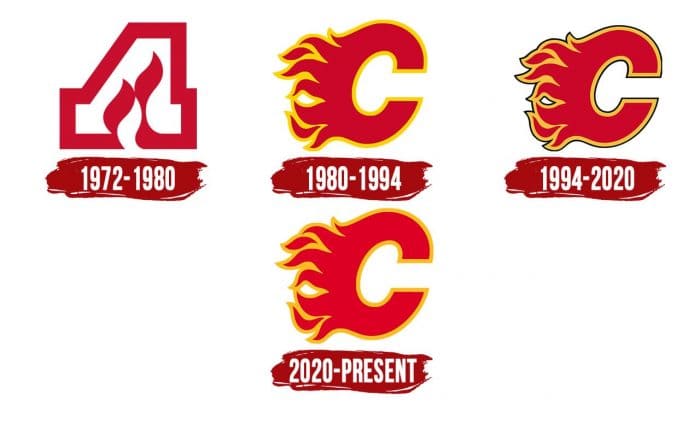
Evolving logos, the Calgary Flames group has never strayed from the first idea. She proceeds with a line that started in Atlanta, so the plan of her old and new signs isn’t exceptionally unique, aside from extremist trials with dark.
1972 – 1980

The hockey club was called Atlanta Flames for eight seasons and flaunted a surprising symbol as a blazing “A.” The inside of the letter was white, and the primary body was dull red. The flares were in the middle and extended vertical. For this situation, the left inclining stroke “A” seemed as though a bolt was pointing down.
1980 – 1994

After moving to Calgary, the group held the moniker Flames; however, presently, it has become related to oil, which was mined in the Canadian area of Alberta. The identification style was likewise saved: it was adjusted for the new city, supplanting “A” with “C.”
The shading range was very splendid: the letter’s orange place was joined with a yellow line, which looked more fascinating than the monochrome adaptation. The fire on the left gave the picture elements. This logo, generally known as Flaming “C,” was made by visual originator Patricia Redditt.
1994 – 2020

The Calgary Flames image has a thin dark line around the edges. It was taken on during the 1990s when the design for dim regalia and dark logos showed up in sports. They were accepted to threaten rivals, so the group didn’t stop for a second to make a scary picture for themselves.
Simultaneously, one more form of the adapted letter “C” was presented – this time dark, with a broad white layout and a scarcely perceptible yellow stroke along the external edge. She decorated the red pullovers of hockey players and became one of the most worldwide changes in the Flames’ set of experiences.
2020 – present

Regarding players’ change in the 2020-2021 season to Full Retro, the group’s administration overhauled the token, returning the first form – 1980. Because of the upgrade, the logo got minor changes that didn’t influence its idea and design. It has continued as before: because of the red tone and tongues of fire, it additionally has unique elements and the topic of oil creation. The changes were made chiefly to the shading and line. The engineers eliminated the thin dark line around the Flaming “C” and left the orange, and changed the dim red to a pale red. They didn’t utilize rich tones, very much like in the introduction logo, picking an option in contrast to the old and the new.
Logos related to Calgary Flames from the Sports Industry
Frequently Asked Questions (FAQ) about the Calgary Flames Logo
The Calgary Flames logo is one of the NHL logos and is an example of the sports industry logo from Canada. According to our data, the Calgary Flames logotype was designed for the sports industry. You can learn more about the Calgary Flames brand on the nhl.com/flames website.
Most logos are distributed vector-based. There are several vector-based file formats, such as EPS, PDF, and SVG. Simple images such as logos will generally have a smaller file size than their rasterized JPG, PNG, or GIF equivalent. You can read more about Raster vs Vector on the vector-conversions.com.
SVG or Scalable Vector Graphics is an XML-style markup-driven vector graphic rendering engine for the browser. Generally speaking, SVG offers a way to do full resolution graphical elements, no matter what size screen, what zoom level, or what resolution your user's device has.
There are several reasons why SVG is smart to store logo assets on your website or use it for print and paper collateral. Benefits including small file size, vector accuracy, W3C standards, and unlimited image scaling. Another benefit is compatibility — even if the facilities offered by SVG rendering engines may differ, the format is backward and forward compatible. SVG engines will render what they can and ignore the rest.
Having the Calgary Flames logo as an SVG document, you can drop it anywhere, scaling on the fly to whatever size it needs to be without incurring pixelation and loss of detail or taking up too much bandwidth.
Since the Calgary Flames presented as a vector file and SVG isn’t a bitmap image, it is easily modified using JavaScript, CSS, and graphic editors. That makes it simple to have a base SVG file and repurpose it in multiple locations on the site with a different treatment. SVG XML code can be created, verified, manipulated, and compressed using various tools from code editors like Microsoft VS Code or Sublime Text to graphic editors such as Figma, Affinity Designer, ADOBE Illustrator, and Sketch.
You can download the Calgary Flames logotype in vector-based SVG (Scalable Vector Graphics) file format on this web page.
According to wikipedia.org: "A logo (an abbreviation of logotype, from Greek: λόγος, romanized: logos, lit. 'word' and Greek: τύπος, romanized: typos, lit. 'imprint') is a graphic mark, emblem, or symbol used to aid and promote public identification and recognition. It may be of an abstract or figurative design or include the text of the name it represents as in a wordmark."
Logos fall into three classifications (which can be combined). Ideographs are abstract forms; pictographs are iconic, representational designs; Logotypes (or Wordmarks) depict the name or company's initials. Because logos are meant to represent companies brands or corporate identities and foster their immediate customer recognition, it is counterproductive to redesign logos frequently.
A logo is the central element of a complex identification system that must be functionally extended to an organization's communications. Therefore, the design of logos and their incorporation into a visual identity system is one of the most challenging and essential graphic design areas.
As a general rule, third parties may not use the Calgary Flames logo without permission given by the logo and (or) trademark owner NHL. For any questions about the legal use of the logo, please contact the NHL directly. You can find contact information on the website nhl.com/flames.
We strive to find official logotypes and brand colors, including the Calgary Flames logo, from open sources, such as wikipedia.org, seeklogo.com, brandsoftheworld.com, famouslogos.net, and other websites; however, we cannot guarantee the Calgary Flames logo on this web page is accurate, official or up-to-date. To get the official Calgary Flames logo, please get in touch with the NHL directly or go to nhl.com/flames.
By downloading the Calgary Flames logo from the Logotyp.us website, you agree that the logo provided "as-is." All the materials appearing on the Logotyp.us website (including company names, logotypes, brand names, brand colors, and website URLs) could include technical, typographical, or photographic errors or typos.
We do not claim any rights to the Calgary Flames logo and provide the logo for informational and non-commercial purposes only. You may not use or register, or otherwise claim ownership in any Calgary Flames trademark, including as or as part of any trademark, service mark, company name, trade name, username, or domain registration. You do not suppose to share a link to this web page as the source of the "official Calgary Flames logo" Thank you.
The color gold in is a warm, metallic yellow color that is often associated with wealth, luxury, and glamour. It is also often associated with the sun and with autumn, as the color is often seen in the leaves of deciduous trees during the fall season. Gold is a very versatile color and can be used in a variety of settings, from formal to casual. In design, it is often used as an accent color to add a touch of sophistication and luxury to a space. It is also often paired with other colors, such as black or silver, to create a classic, elegant look. In fashion, gold is often used as an accent color to add a touch of glamour and shine to an outfit. The color red is a warm, vibrant color that is often associated with strong emotions such as passion, love, and anger. It is also often associated with power, strength, and determination. In design, red can be used to create a bold, attention-grabbing visual impact. It is also often used to represent danger or warning, as it is the color of stop signs and warning lights. In fashion, red is often used to add a pop of color to an outfit and can be used to make a statement or stand out in a crowd. The color red is also associated with love and romance, and is often used in Valentine's Day and Christmas decorations.
It's important to note that these associations are not universal, and different people may have different emotional responses to colors.

