Colorado Avalanche
Colorado Avalanche logo preview
Learn more about Colorado Avalanche, find out the Colorado Avalanche brand colors, and download Colorado Avalanche vector logo in the SVG file format. Find related logos. Looking for a raster logo? Here you can download PNG Colorado Avalanche logo on a transparent background as well.
Brand information
| Website | Colorado Avalanche |
| Country | United States |
| Industry | Sports |
| Rating | 91/100 (16 votes) |
| Updated | Jun 11, 2024 |
The Colorado Avalanche logo features blue red silver black colors
This is a color scheme of Colorado Avalanche. You can copy each of the logo colors by clicking on a button with the color HEX code above.
NHL logos
The Colorado Avalanche are a professional ice hockey team based in Denver, Colorado. They are members of the Central Division of the Western Conference of the National Hockey League (NHL). The Avalanche are the only team in their division not based in the Central Time Zone; the team is situated in the Mountain Time Zone. Their home arena is Pepsi Center. Their general manager is Joe Sakic.
The Colorado Avalanche logo had gone through just a single revolutionary redesign, which was necessary for the rebranding system when the group was renamed.
Meaning and history
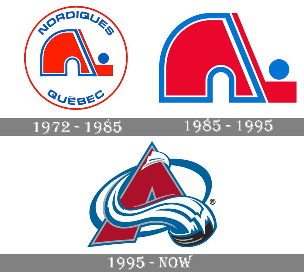
The Colorado Avalanche hockey club was brought into the world in Quebec, Canada, and played there until 1995, Quebec Nordiques. So the visual personality history of the group must be isolated into two periods — The Nordiques and The Avalanche, which include three distinct logo forms by and large.
1972 — 1985
The first Quebec Nordiques logo, made in 1972, became unmistakable regardless of whether in lovely quick as it was a brilliant and moderate identification with fascinating calculation. The principal logo of the group included a white round identification in a blue framework with a red adapted picture of an igloo with its right part askew cut with the hockey stick and a puck above it.
The blue sans-serif engraving was put inside the circle, around its edge, with the “Nordiques” curved above and “Quebec” — under the igloo.
1985 — 1995
The update of 1985 was about the improvement of the token and depreciation of the components. This the group just kept the igloo with the hockey stick, and eliminated the wordmark and the roundabout casing of the past adaptation. The blue tone was eased up, which made the shading differentiation of the identification more grounded and gave a new and fresh inclination to the Nordiques’ visual character.
1995 — Today
1995 was an exceptionally great year for the hockey club. First and foremost, the new logo was intended for Nordiques, it included an advanced and smooth Wolf picture, put on a triangle, pointing down, and with a virus dark engraving under the creature’s head. This logo should become essential for the Quebec group, however in a couple of months, the club moved to Denver, Colorado, and changed its name to Colorado Avalanche.
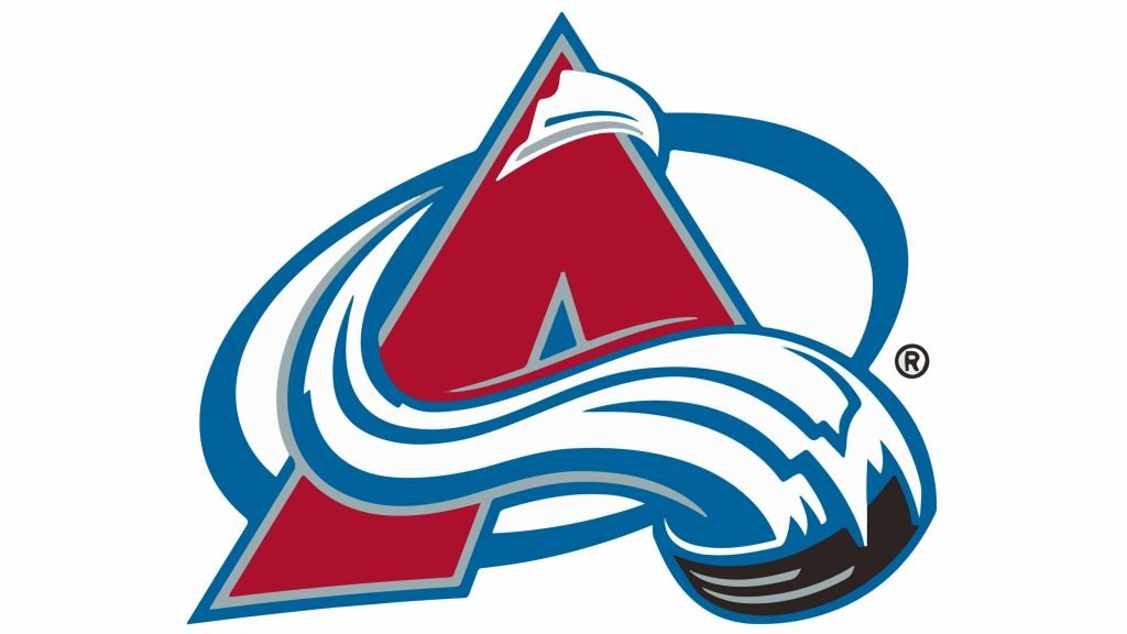
The logo for the rebranded hockey club was made by The Joe Bosack Graphic Design Co and contained a striking burgundy letter “A” adapted as a mountain harmony, with smooth white and blue lines around it, addressing snow and ice.
The new brilliant yet rich burgundy, white and blue shading range was likewise embraced for the auxiliary insignias of Colorado Avalanche: a sasquatch stride in a blue round diagram and a letter “C” with the hockey puck in the center.
Logos related to Colorado Avalanche from the Sports Industry
Frequently Asked Questions (FAQ) about the Colorado Avalanche Logo
The Colorado Avalanche logo is one of the NHL logos and is an example of the sports industry logo from United States. According to our data, the Colorado Avalanche logotype was designed for the sports industry. You can learn more about the Colorado Avalanche brand on the nhl.com/avalanche website.
Most logos are distributed vector-based. There are several vector-based file formats, such as EPS, PDF, and SVG. Simple images such as logos will generally have a smaller file size than their rasterized JPG, PNG, or GIF equivalent. You can read more about Raster vs Vector on the vector-conversions.com.
SVG or Scalable Vector Graphics is an XML-style markup-driven vector graphic rendering engine for the browser. Generally speaking, SVG offers a way to do full resolution graphical elements, no matter what size screen, what zoom level, or what resolution your user's device has.
There are several reasons why SVG is smart to store logo assets on your website or use it for print and paper collateral. Benefits including small file size, vector accuracy, W3C standards, and unlimited image scaling. Another benefit is compatibility — even if the facilities offered by SVG rendering engines may differ, the format is backward and forward compatible. SVG engines will render what they can and ignore the rest.
Having the Colorado Avalanche logo as an SVG document, you can drop it anywhere, scaling on the fly to whatever size it needs to be without incurring pixelation and loss of detail or taking up too much bandwidth.
Since the Colorado Avalanche presented as a vector file and SVG isn’t a bitmap image, it is easily modified using JavaScript, CSS, and graphic editors. That makes it simple to have a base SVG file and repurpose it in multiple locations on the site with a different treatment. SVG XML code can be created, verified, manipulated, and compressed using various tools from code editors like Microsoft VS Code or Sublime Text to graphic editors such as Figma, Affinity Designer, ADOBE Illustrator, and Sketch.
You can download the Colorado Avalanche logotype in vector-based SVG (Scalable Vector Graphics) file format on this web page.
According to wikipedia.org: "A logo (an abbreviation of logotype, from Greek: λόγος, romanized: logos, lit. 'word' and Greek: τύπος, romanized: typos, lit. 'imprint') is a graphic mark, emblem, or symbol used to aid and promote public identification and recognition. It may be of an abstract or figurative design or include the text of the name it represents as in a wordmark."
Logos fall into three classifications (which can be combined). Ideographs are abstract forms; pictographs are iconic, representational designs; Logotypes (or Wordmarks) depict the name or company's initials. Because logos are meant to represent companies brands or corporate identities and foster their immediate customer recognition, it is counterproductive to redesign logos frequently.
A logo is the central element of a complex identification system that must be functionally extended to an organization's communications. Therefore, the design of logos and their incorporation into a visual identity system is one of the most challenging and essential graphic design areas.
As a general rule, third parties may not use the Colorado Avalanche logo without permission given by the logo and (or) trademark owner NHL. For any questions about the legal use of the logo, please contact the NHL directly. You can find contact information on the website nhl.com/avalanche.
We strive to find official logotypes and brand colors, including the Colorado Avalanche logo, from open sources, such as wikipedia.org, seeklogo.com, brandsoftheworld.com, famouslogos.net, and other websites; however, we cannot guarantee the Colorado Avalanche logo on this web page is accurate, official or up-to-date. To get the official Colorado Avalanche logo, please get in touch with the NHL directly or go to nhl.com/avalanche.
By downloading the Colorado Avalanche logo from the Logotyp.us website, you agree that the logo provided "as-is." All the materials appearing on the Logotyp.us website (including company names, logotypes, brand names, brand colors, and website URLs) could include technical, typographical, or photographic errors or typos.
We do not claim any rights to the Colorado Avalanche logo and provide the logo for informational and non-commercial purposes only. You may not use or register, or otherwise claim ownership in any Colorado Avalanche trademark, including as or as part of any trademark, service mark, company name, trade name, username, or domain registration. You do not suppose to share a link to this web page as the source of the "official Colorado Avalanche logo" Thank you.
The color silver is a cool, pale grey color with a metallic finish. It is often described as sleek, sophisticated, and modern. In a light setting, silver appears shiny and reflective, while in a darker setting, it can appear more matte and subdued. The color is often associated with elegance, wealth, and sophistication. It is also often used to represent technology and industry. In fashion and design, silver is often paired with black or white for a sleek, modern look, and it is also used to accentuate other colors. The color red is a warm, vibrant color that is often associated with strong emotions such as passion, love, and anger. It is also often associated with power, strength, and determination. In design, red can be used to create a bold, attention-grabbing visual impact. It is also often used to represent danger or warning, as it is the color of stop signs and warning lights. In fashion, red is often used to add a pop of color to an outfit and can be used to make a statement or stand out in a crowd. The color red is also associated with love and romance, and is often used in Valentine's Day and Christmas decorations. The color black is a neutral color that is often associated with sophistication, elegance, and power. It is a strong, bold color that is often used to create a dramatic visual impact. In design, black is often used to create a sleek, modern look, and it is also often used to represent sophistication and luxury. In fashion, black is often used to create a sleek, classic look, and it is also often associated with formality and evening wear. The color black is also often associated with mystery, darkness, and the unknown. Blue is a color that is often described as cool, calming, and serene. It is typically associated with the sky and the ocean, and is often used to evoke feelings of tranquility and peacefulness. In terms of its visual appearance, blue is a primary color that is located on the opposite end of the spectrum from red. It is often described as a cool color, as it tends to recede and appear farther away than warm colors such as red, orange, and yellow. Blue is also often described as a soothing and relaxing color, and is often used in hospitals and other healthcare settings to promote a sense of calm and well-being. Blue is a popular color that is often used in fashion, design, and marketing. It is often paired with other colors to create a range of effects, and can be used to create a sense of contrast or to create a cohesive look. Blue is also a popular color for logos, branding, and other visual identity elements, as it is often associated with trustworthiness, reliability, and intelligence.
It's important to note that these associations are not universal, and different people may have different emotional responses to colors.

