Edmonton Oilers
Edmonton Oilers logo preview
Learn more about Edmonton Oilers, find out the Edmonton Oilers brand colors, and download Edmonton Oilers vector logo in the SVG file format. Find related logos. Looking for a raster logo? Here you can download PNG Edmonton Oilers logo on a transparent background as well.
NHL logos
The Edmonton Oilers are a professional ice hockey team based in Edmonton, Alberta. They are members of the Pacific Division of the Western Conference of the National Hockey League (NHL).
The Edmonton Oilers are an ice hockey group situated in Edmonton, Alberta, Canada. They contend in the Pacific Division of the Western Conference of the National Hockey League. The Canadian territory of Alberta, where there are grasslands and oil fields, cowhands, and oil derricks, was the country of numerous extraordinary players. It couldn’t manage without a World Hockey Association group. Bill Hunter, the proprietor of the Edmonton Oil Kings junior group, made endless endeavors to bring the NHL group to Edmonton. Yet, the NHL authorities would not set up another establishment there. At last, Bill Hunter figured out how to begin an establishment inside the World Hockey Association.
Additionally, the WHA planned to put two groups in Alberta – in Edmonton and Calgary. The primary group was named “Oilers” out of appreciation for the oil derricks, while the subsequent club was given the name of “Horses” to pay tribute to ranchers. There are no oil derricks in Edmonton (every one of them is situated in the northern piece of the territory). However, this name impeccably suits the profoundly modern city. During the 1950s and 1960s, Edmonton was an old neighborhood for a relatively well-known Oil Kings junior group.
The Calgary group was moved to Ohio to turn into the Cleveland Crusaders before the primary WHA season. Accordingly, it was chosen to name the Edmonton-based group as “Alberta Oilers” since it should introduce the whole territory. It was likewise arranged that the club would play half of its home games in Calgary. The shading plan included orange, white, and blue. The logo highlighted an oil bead over the “OILERS” wordmark.
Toward the start of the primary season, surging between two urban communities would be monetarily expensive and depleting. The Oilers eventually didn’t play any host games in Calgary and returned to “Edmonton Oilers.”
The orange tone in a group range presumably irritated many individuals since two other WHA groups took advantage of it. In 1974, blue turned into the critical shade of the club. The Edmonton Oilers image was additionally changed: the home shirt had a white oil drop on a red field; the away pullover had a blue drop on a white area.
Meaning and History
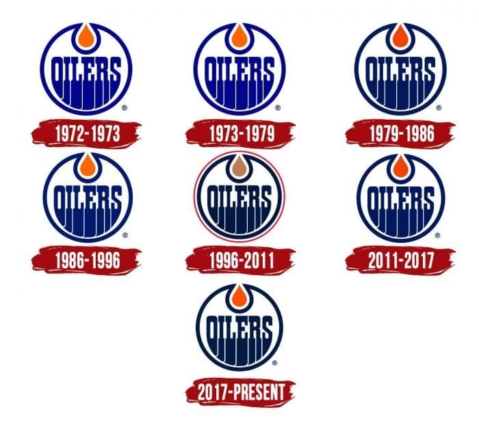
The Edmonton Oilers traditionally styled round logo has not changed more than 40 years of establishment presence. Albeit the group has seven stamps, they are similar sorts in general. There have been no significant changes beginning around 1972. The changes concerned just minor subtleties: shades of tone and edging. Such consistency discusses the solidness of the establishment – that the picked seal flawlessly coordinates with its idea. Like this, even in the wake of changing the name of Alberta Oilers to Edmonton Oilers, the club stayed with its introduction variant.
1972 – 1973
The first logo, Edmonton Oilers, was presented in 1972. It included the “Oilers” wordmark inside a circle, both given in illustrious blue. The lettering was intended to look like streaming fluid. At the top, there was an orange oil drop inside another blue circle.
1973 – 1979

1979 – 1986
The 1980 logo’s general plan stayed unaltered, yet it was the time of the first shading shifts. Both the name of the group and the circle became hazier, just as the oil bead.
1986 – 1996
1996 – 2011
2011 – 2017

2017 – present
The advanced logo design is a shading redundancy of the 1996-2011 engraving. In any case, it is unique – without a red ring and with a sharp drop of oil. The presence of the letters “streaming” downwards compares to the wide range of various seals because the progressions concerned mainly conceals. Accordingly, the current logo by all accounts, size, setup, and components compares to the presentation, supported in 1972.
Logos related to Edmonton Oilers from the Sports Industry
Frequently Asked Questions (FAQ) about the Edmonton Oilers Logo
The Edmonton Oilers logo is one of the NHL logos and is an example of the sports industry logo from Canada. According to our data, the Edmonton Oilers logotype was designed for the sports industry. You can learn more about the Edmonton Oilers brand on the nhl.com/oilers website.
Most logos are distributed vector-based. There are several vector-based file formats, such as EPS, PDF, and SVG. Simple images such as logos will generally have a smaller file size than their rasterized JPG, PNG, or GIF equivalent. You can read more about Raster vs Vector on the vector-conversions.com.
SVG or Scalable Vector Graphics is an XML-style markup-driven vector graphic rendering engine for the browser. Generally speaking, SVG offers a way to do full resolution graphical elements, no matter what size screen, what zoom level, or what resolution your user's device has.
There are several reasons why SVG is smart to store logo assets on your website or use it for print and paper collateral. Benefits including small file size, vector accuracy, W3C standards, and unlimited image scaling. Another benefit is compatibility — even if the facilities offered by SVG rendering engines may differ, the format is backward and forward compatible. SVG engines will render what they can and ignore the rest.
Having the Edmonton Oilers logo as an SVG document, you can drop it anywhere, scaling on the fly to whatever size it needs to be without incurring pixelation and loss of detail or taking up too much bandwidth.
Since the Edmonton Oilers presented as a vector file and SVG isn’t a bitmap image, it is easily modified using JavaScript, CSS, and graphic editors. That makes it simple to have a base SVG file and repurpose it in multiple locations on the site with a different treatment. SVG XML code can be created, verified, manipulated, and compressed using various tools from code editors like Microsoft VS Code or Sublime Text to graphic editors such as Figma, Affinity Designer, ADOBE Illustrator, and Sketch.
You can download the Edmonton Oilers logotype in vector-based SVG (Scalable Vector Graphics) file format on this web page.
According to wikipedia.org: "A logo (an abbreviation of logotype, from Greek: λόγος, romanized: logos, lit. 'word' and Greek: τύπος, romanized: typos, lit. 'imprint') is a graphic mark, emblem, or symbol used to aid and promote public identification and recognition. It may be of an abstract or figurative design or include the text of the name it represents as in a wordmark."
Logos fall into three classifications (which can be combined). Ideographs are abstract forms; pictographs are iconic, representational designs; Logotypes (or Wordmarks) depict the name or company's initials. Because logos are meant to represent companies brands or corporate identities and foster their immediate customer recognition, it is counterproductive to redesign logos frequently.
A logo is the central element of a complex identification system that must be functionally extended to an organization's communications. Therefore, the design of logos and their incorporation into a visual identity system is one of the most challenging and essential graphic design areas.
As a general rule, third parties may not use the Edmonton Oilers logo without permission given by the logo and (or) trademark owner NHL. For any questions about the legal use of the logo, please contact the NHL directly. You can find contact information on the website nhl.com/oilers.
We strive to find official logotypes and brand colors, including the Edmonton Oilers logo, from open sources, such as wikipedia.org, seeklogo.com, brandsoftheworld.com, famouslogos.net, and other websites; however, we cannot guarantee the Edmonton Oilers logo on this web page is accurate, official or up-to-date. To get the official Edmonton Oilers logo, please get in touch with the NHL directly or go to nhl.com/oilers.
By downloading the Edmonton Oilers logo from the Logotyp.us website, you agree that the logo provided "as-is." All the materials appearing on the Logotyp.us website (including company names, logotypes, brand names, brand colors, and website URLs) could include technical, typographical, or photographic errors or typos.
We do not claim any rights to the Edmonton Oilers logo and provide the logo for informational and non-commercial purposes only. You may not use or register, or otherwise claim ownership in any Edmonton Oilers trademark, including as or as part of any trademark, service mark, company name, trade name, username, or domain registration. You do not suppose to share a link to this web page as the source of the "official Edmonton Oilers logo" Thank you.
The color orange is a warm, vibrant color that is often associated with energy, cheerfulness, and happiness. It is a combination of red and yellow, and is often seen as a cheerful, energetic color. In design, orange is often used to add a pop of color to a space and can be used to create a warm, welcoming atmosphere. In fashion, orange is often used to add a touch of fun and playfulness to an outfit. The color orange is also often associated with autumn, as it is often seen in the leaves of deciduous trees during the fall season. Blue is a color that is often described as cool, calming, and serene. It is typically associated with the sky and the ocean, and is often used to evoke feelings of tranquility and peacefulness. In terms of its visual appearance, blue is a primary color that is located on the opposite end of the spectrum from red. It is often described as a cool color, as it tends to recede and appear farther away than warm colors such as red, orange, and yellow. Blue is also often described as a soothing and relaxing color, and is often used in hospitals and other healthcare settings to promote a sense of calm and well-being. Blue is a popular color that is often used in fashion, design, and marketing. It is often paired with other colors to create a range of effects, and can be used to create a sense of contrast or to create a cohesive look. Blue is also a popular color for logos, branding, and other visual identity elements, as it is often associated with trustworthiness, reliability, and intelligence.
It's important to note that these associations are not universal, and different people may have different emotional responses to colors.

