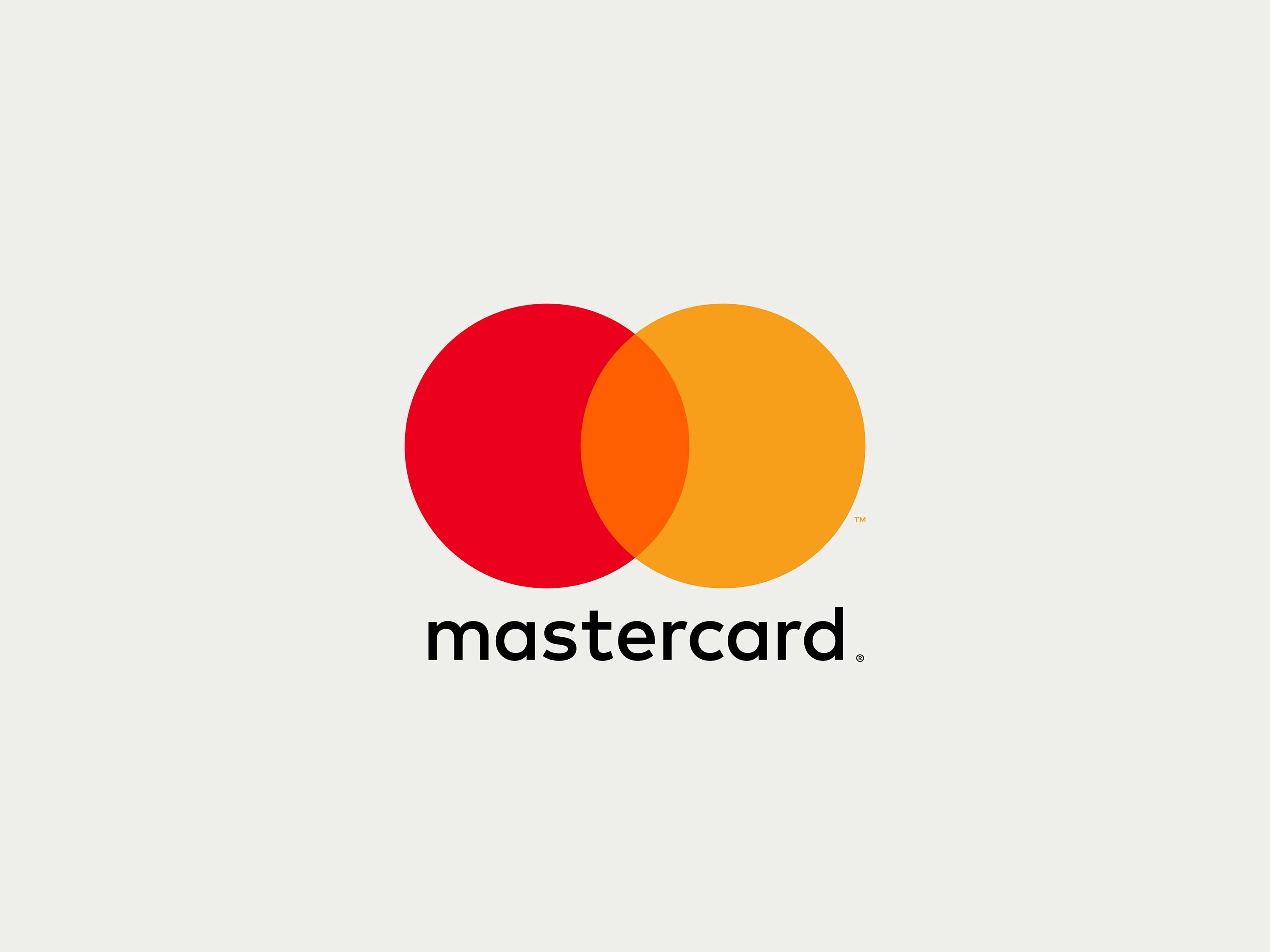
The iconic red and yellow intersecting circles of Mastercard are one of the world’s most recognized brands. Today the company launches an evolution of its brand identity featuring a new mark that highlights the connectivity and seamlessness of Mastercard and its payment systems. Designed by Pentagram, the identity brings simplicity and clarity with an increased emphasis on the interlocking circles, and is optimized for use in digital contexts, an increasingly important part of Mastercard’s business.
The Pentagram team collaborated closely with Mastercard leadership on the project, including Raja Rajamannar, Chief Marketing and Communications Officer. The goal was to convey simplicity and modernity, while preserving the company’s heritage and enormous brand equity. Digital technology is a growing segment of Mastercard’s business, and it needed an identity that would help position the brand as a forward-thinking, people-centered technology company. The new mark is designed to work seamlessly across all digital platforms, retail channels and connected devices.
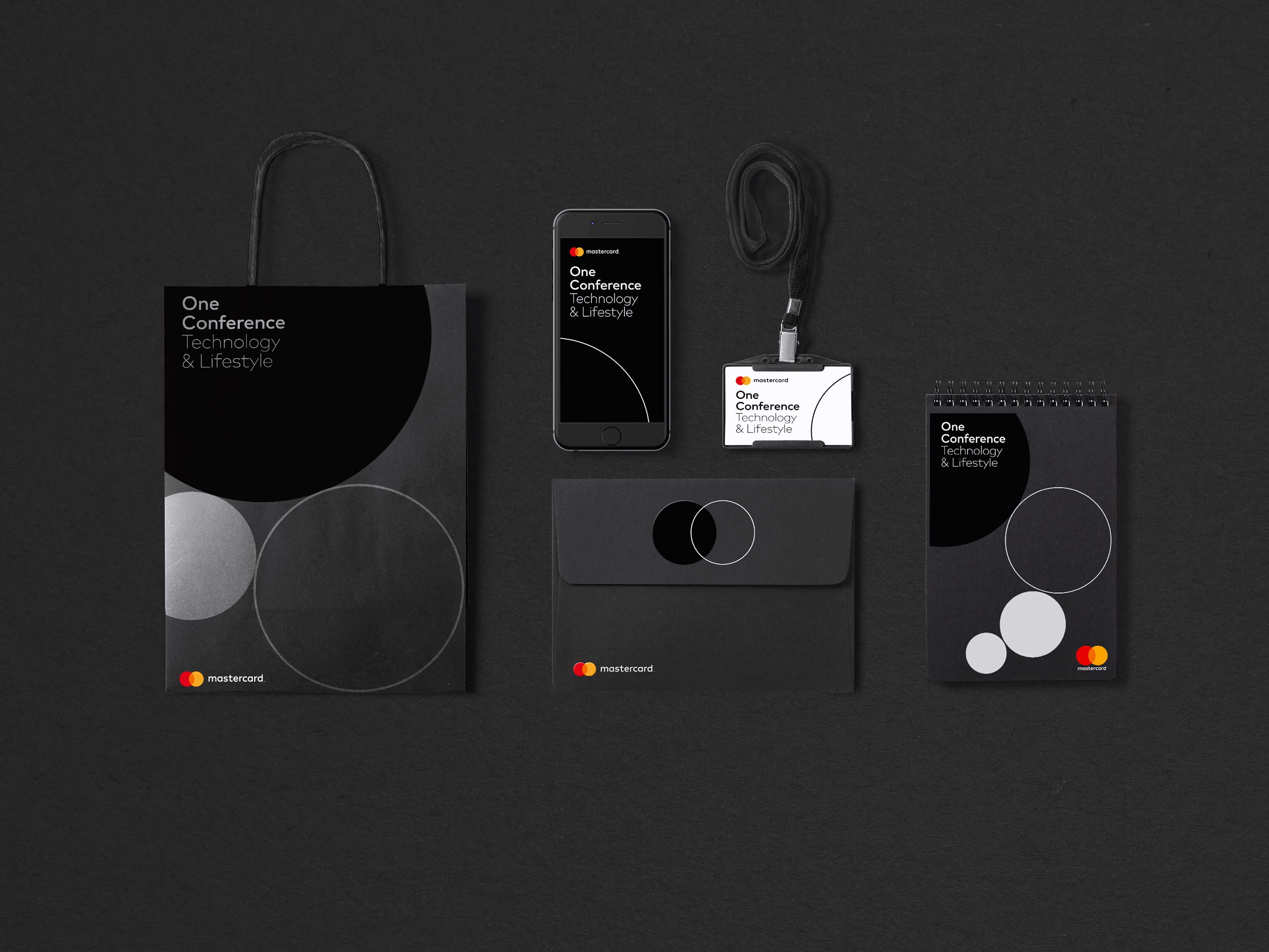
The new logo represents both Mastercard the company and the full suite of Mastercard products and services, creating a single brand system for the entire organization as well as its existing and future products. This replaces a 2006 version of the logo that was meant to distinguish Mastercard corporate from the consumer-facing image. The new brand mark will be used across every touchpoint of the Mastercard brand, from the cards carried by consumers, to signage at Mastercard headquarters, to the digital payment system on smartphones.
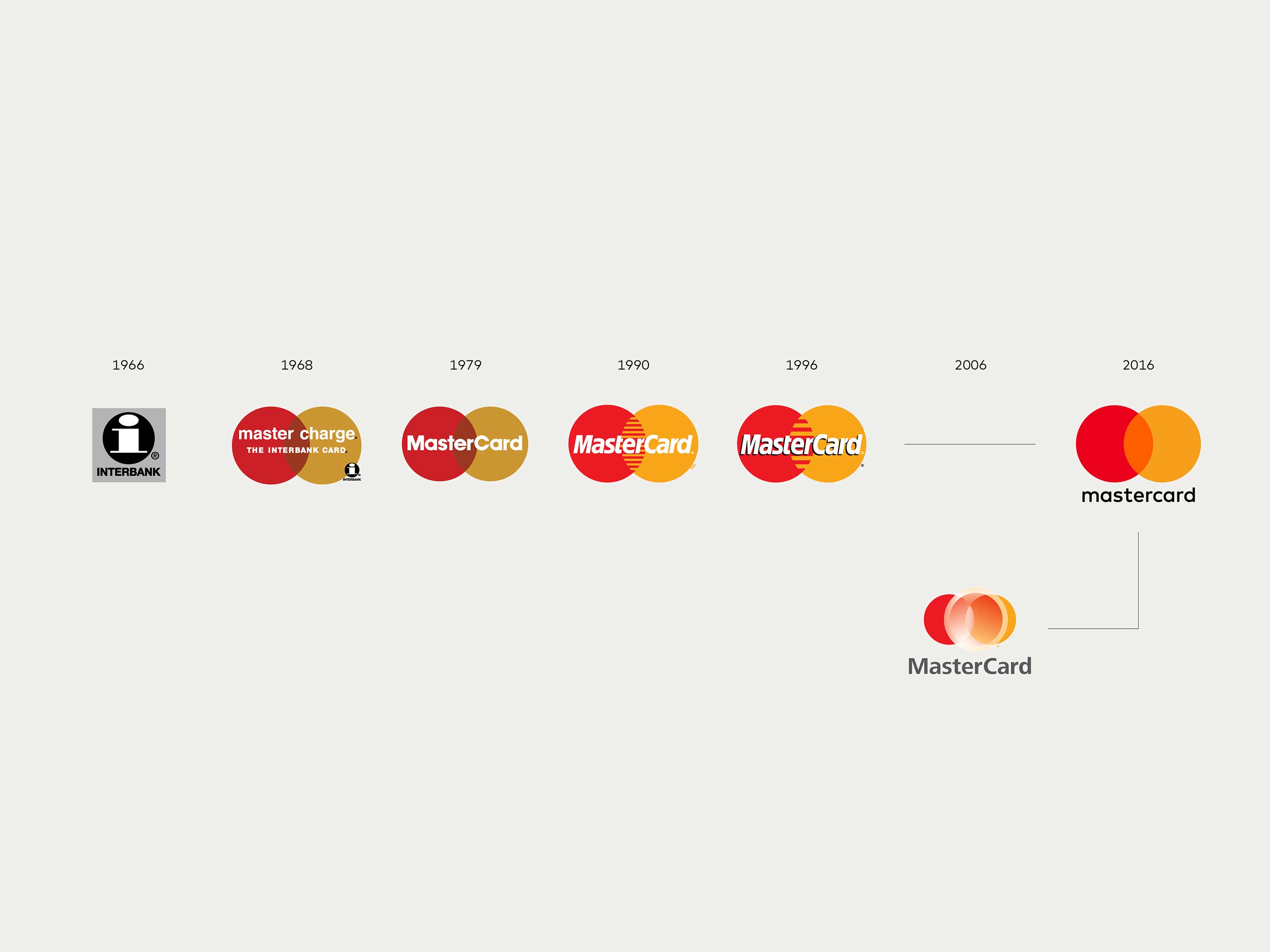
To create the new symbol, the designers isolated the brand’s elements to their purest form. From the very beginning, in 1968, Mastercard’s brand mark has relied on extraordinarily simple elements: two interlocking circles in red and yellow. The overlapping forms effortlessly express the idea of connection, while the basic circular shapes suggest inclusiveness and accessibility, key to Mastercard’s brand message of “priceless possibilities.” The new brand mark preserves and builds on this iconic foundation, providing a crisper look that has flexible configurations more suited for digital applications.
To date, over 2.3 billion cards around the world have been issued with an existing Mastercard brand mark, and millions of merchants display the Mastercard acceptance mark. The simplicity of the new mark allows it to co-exist with these older iterations as the various brand expressions are updated and implemented, starting with Masterpass, the digital payment service, which will introduce the new identity this month. In global market research for the mark, Mastercard found that an astonishing 81 percent of consumers spontaneously recognized the new symbol without the inclusion of the Mastercard brand name.
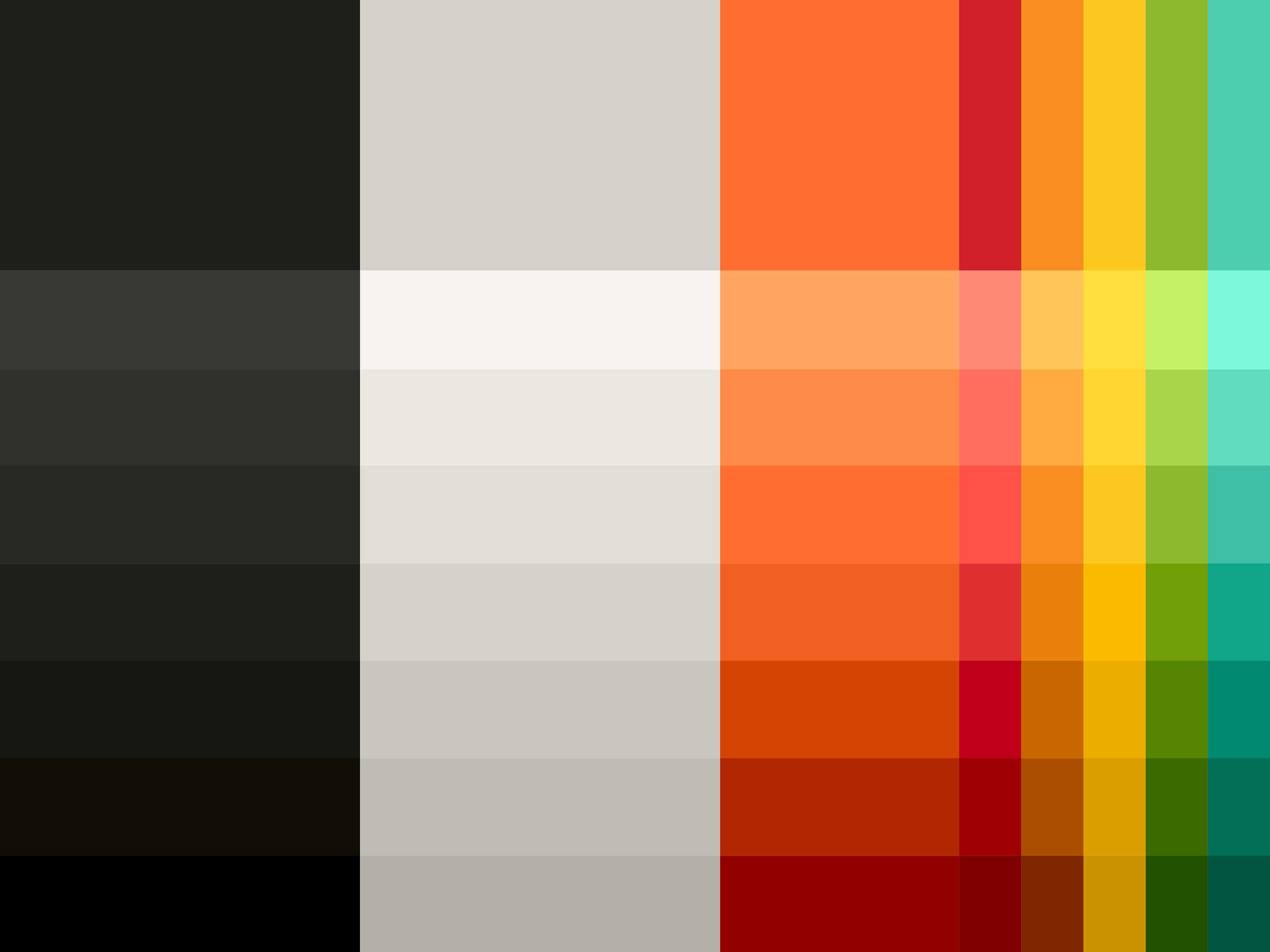
The entire identity is built using the core elements found in the logo: geometry and color. A new set of graphic tools have been developed to help Mastercard communicate effectively and concisely in all media. The tools consist of a distinctive color palette, a new typographic system, and pure graphic shapes with parameters that enable the creation of an infinite series of varied yet connected graphic patterns. In addition, custom icon sets, illustrations and photographic styles have been established to create a consistent visual system to express a wide range of messages.
One of the subtle changes was to lowercase the “c” in the wordmark, as a visual cue to de-emphasize how the brand is no longer just a card in consumers’ wallets, and will continue to give way to other forms of payment in the digital world. The lowercase typography is in line with the simple and modern approach, and allows for a consistent treatment in names of products such as Masterpass.
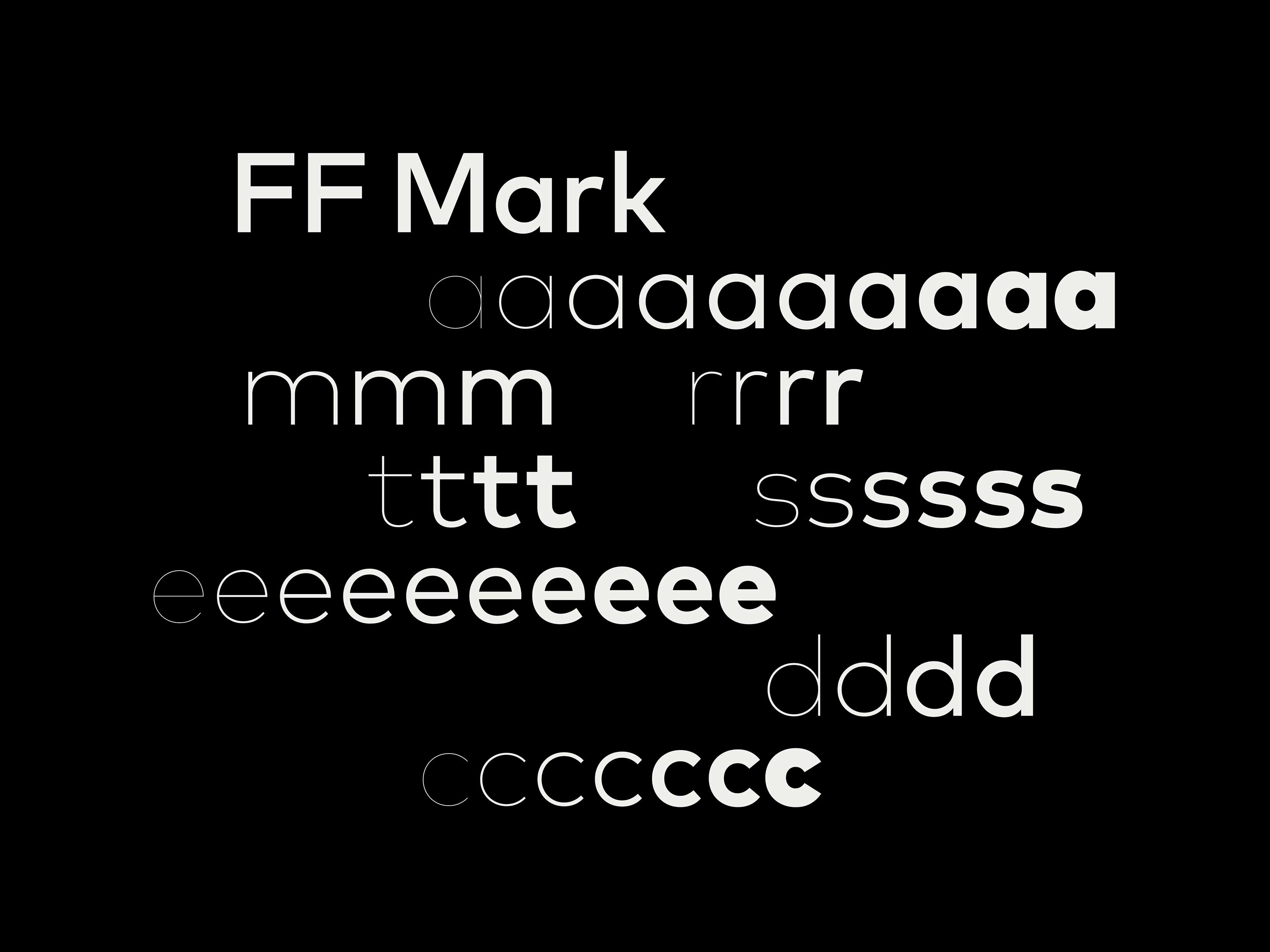
The wordmark is set in the contemporary sans serif FF Mark. During its research, the team looked back to a version of the logo used in 1979, which featured typography with a circular structure. The new typography plays on the perfectly circular forms of the mark, with rounded letterforms that each contain a portion of the circle (even “m” and “t”).
Getting the three colors in the mark right was a challenge for the designers, requiring hundreds of tests to find the perfect hues that would work successfully in every conceivable context. The logo needed to work on white backgrounds, black backgrounds, and different values in between. This meant that the colors had to be carefully calibrated, so they would stand out and not disappear, and have sufficient contrast from the orange in between.
In the final mark, the color of the overlap is both lighter than the red and darker than the yellow, suggesting that the two circles are translucent, rather than solid, giving the brand a feeling of transparency. The original Mastercard logo used a subtractive color mix: when the red and yellow circles overlapped, they created a darker color. The new symbol uses an additive mix—the colors now produce a brighter orange. This projects an overall effect that is lighter and fresher, giving the symbol a subtle glow and a bolder, more optimistic feel.
In applications, the graphic elements complement the typography and are built parametically around mathematical principles found in the mark. Coupled with the power of computing, the parametric design generates infinite arrangements, each different from the next, though all part of the same visual system.
The complete color palette is built from scales surrounding the red and yellow of the logo. The use of warm greys, both dark and light, as the base for all compositions ensures neutrality. Orange is the new primary color, a perfect midpoint between red and yellow.
Psychology of colors in the Mastercard logo: understanding the power of color in branding.
Yellow radiates optimism and energy in the brand design. It brings warmth and positivity, creating an inviting and cheerful presence. This vibrant color helps brands communicate creativity and confidence.
Red adds passion and energy to the brand. It creates an immediate impact, drawing attention and stimulating emotion. This powerful color choice helps brands stand out and create memorable impressions.
Black provides power and elegance to the brand identity. It represents sophistication and authority, creating a strong visual presence. This timeless color choice helps brands communicate premium quality and exclusivity.
Frequently Asked Questions (FAQ) about the Mastercard Logo
The Mastercard logo is one of the Mastercard logos and is an example of the Banking and Finance industry logo from United States. According to our data, the Mastercard logotype was designed in 2016 in the Pentagram agency. You can learn more about the Mastercard brand on the www.mastercard.us/en-us.html website.
SVG (Scalable Vector Graphics) is a modern vector-based file format that allows graphics to remain sharp and clear at any resolution. Unlike pixel-based formats like PNG and JPEG, SVG uses mathematical equations to define shapes, which ensures that the image does not lose quality no matter how much it is resized.
In addition to scalability, SVG offers other benefits, such as support for animations and interactive elements. It can be styled with CSS and manipulated with JavaScript, making it a powerful choice for web design. Many brands prefer SVG for their logos because it ensures a consistent, high-quality appearance across different screen sizes and devices.
Furthermore, SVG files are typically smaller in size compared to high-resolution raster images, which helps websites load faster and improves search engine rankings. For these reasons, SVG is a popular format for logos and branding elements.
To open and edit an SVG logo file, there are several tools available, each catering to different needs. If you're looking for professional design software, Adobe Illustrator, CorelDRAW, and Affinity Designer provide advanced vector editing capabilities. These programs allow precise adjustments to logo shapes, colors, and effects.
For those who prefer working online, platforms like Figma and Vectr enable you to edit SVG files without the need for software installation. These online tools are particularly useful for quick modifications and collaborative design work.
Developers and coders can also modify SVG files using text editors such as Visual Studio Code, Sublime Text, or Notepad++. Since SVG files are XML-based, they can be edited directly in code format to adjust properties like colors, gradients, and animations.
If you need to convert an SVG file to another format, free tools like Inkscape or Convertio can help you export it as PNG, JPEG, or PDF, depending on your requirements.
A logo, also known as a logotype, is a visual representation of a brand, company, or organization. It is one of the most essential components of brand identity, helping to establish recognition and credibility in the market.
Logos can be categorized into different styles. Some brands use wordmarks, which feature only the brand name in a unique font, such as Google or Coca-Cola. Others opt for lettermarks, which are abbreviated initials, like IBM or NASA. Iconic logos use symbols or graphics to represent the brand, as seen in the Apple logo or Nike’s swoosh. Combination marks blend text and symbols, such as the Adidas or Burger King logos.
The goal of a logo is to create a memorable and easily recognizable symbol that conveys the values and personality of a brand. A well-designed logo should be simple, scalable, and effective across various mediums.
Colors play a crucial role in how a brand is perceived by consumers. Different colors evoke different emotions and associations. For example, blue is often linked to trust and professionalism, making it a popular choice for financial and tech companies. Red is associated with excitement and urgency, commonly used in food and retail brands. Green is linked to nature, health, and sustainability, making it ideal for eco-friendly businesses.
When designing a logo, selecting the right colors can help reinforce a brand’s message and attract the target audience. A well-chosen color scheme enhances brand recognition and differentiation in the market.
To create a timeless logo, designers should focus on simplicity, versatility, and brand relevance. A simple logo is more memorable and recognizable, ensuring it remains effective across different platforms and media. Avoiding overly trendy elements helps prevent the design from becoming outdated too quickly.
Versatility is also key—logos should look great in both color and black-and-white formats, and they should be scalable without losing quality. Lastly, ensuring that the logo reflects the brand’s core values and identity makes it more enduring in the market.