Nashville Predators
Nashville Predators logo preview
Learn more about Nashville Predators, find out the Nashville Predators brand colors, and download Nashville Predators vector logo in the SVG file format. Find related logos. Looking for a raster logo? Here you can download PNG Nashville Predators logo on a transparent background as well.
Brand information
| Website | Nashville Predators |
| Country | United States |
| Industry | Sports |
| Year | 2011 |
| Rating | 92/100 (53 votes) |
| Updated | Jun 11, 2024 |
The Nashville Predators logo features yellow blue colors
This is a color scheme of Nashville Predators. You can copy each of the logo colors by clicking on a button with the color HEX code above.
NHL logos
The Nashville Predators are a professional ice hockey team based in Nashville, Tennessee. They are members of the Central Division of the Western Conference of the National Hockey League (NHL). The Predators’ television broadcasting rights are held by Fox Sports Tennessee, whereas radio broadcasting rights are held by WPRT-FM. The Predators have played their home games at Bridgestone Arena since 1998.

The Nashville Predators logo includes a side perspective on the saber-toothed tiger in blue and gold against the white foundation.
Meaning and history
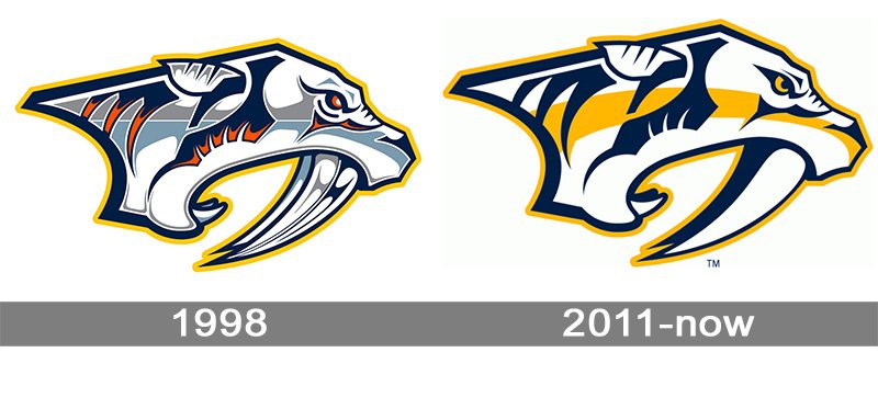
In 1995, bits of gossip spread among avid supporters in Nashville that the New Jersey Devils would move there to the Nashville Arena, which was being developed at that point. Notwithstanding, the endeavor to carry the Devils to Nashville fizzled while the field opened the following years.
Not long after, the city made another endeavor, this time. They attempted to get the NBA’s Sacramento Kings. When it worked out that the club wouldn’t move, either, Nashville pursued a hockey group.
In the late spring of 1997, the National Hockey League conceded a contingent establishment to Nashville, following the solicitation from a gathering headed by finance manager Craig Leipold.
1998 — 2011

The most intriguing thing about the Nashville Predators logo history is presumably that the logo showed up before the group.
Not long after the city got a development establishment in 1997, the proprietors uncovered an image, which looked somewhat surprising for a hockey logo. It was a six-shading insignia portraying a creature with sharp teeth, which ended up being a saber-toothed tiger. The name for the club was to be picked by fans themselves. The club proprietors got around 75 words and picked three: Ice Tigers, Fury, and Attack.
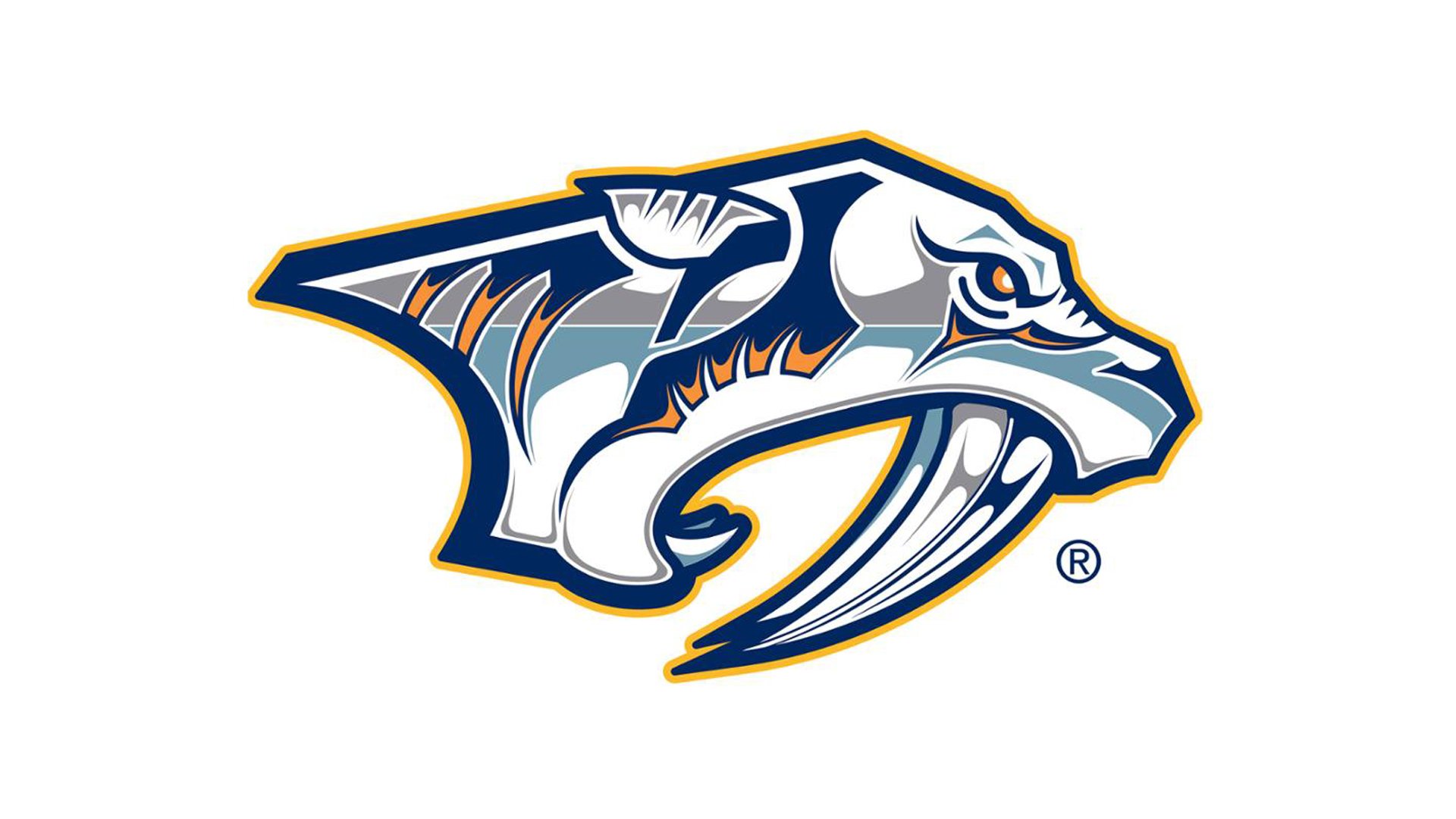
Notwithstanding, none of the names appeared to fulfill most of the fans, just as the group proprietors. At last, Craig Leipold recommended his form, “Hunters.” This same form won in the previous vote.
2011 — Today
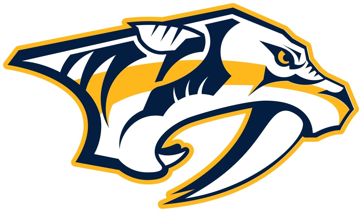
In 2012, the Preds logo was returned. The change might not be that undeniable from the main look, yet on the off chance that you investigate, you might see that the shading plan has become more accessible (three tones rather than six). There have likewise been two or three minor modifications looking like the components. For example, the understudy in the animal’s eye has become more particular. This seal is highlighted on the Nashville Predators garbs.

Secondary emblem
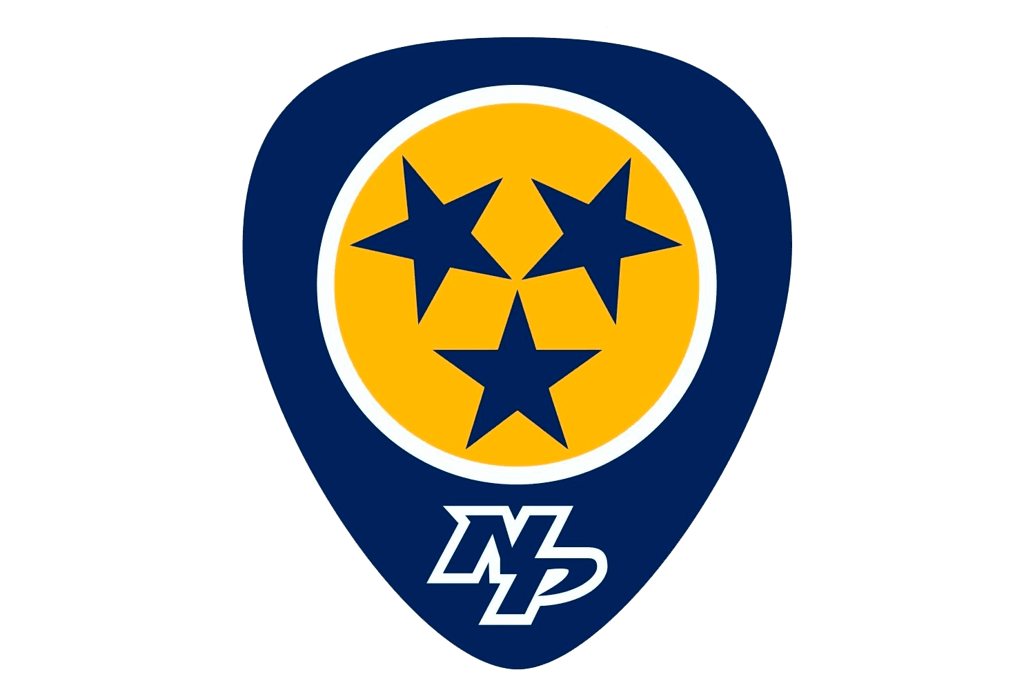
There are somewhere around two different logotypes. One of them includes a naval force blue identification with three blue stars in a yellow circle and “N” and “P” beneath. The blue stars come from the banner of the group’s home state, Tennessee.

The other substitute logo addresses two 3D letters, “N” and “P,” in white with blue and yellow casings. The group likewise utilized the skull of the saber-toothed tiger as its optional logo.
Why is a saber-toothed tiger the symbol?

The appropriate response is established throughout the entire existence of Nashville. In 1971, development works began on UBS Tower, one of the city’s most great structures. While working, teams found a skeleton of the types of saber-toothed tiger known under the name of Smilodon Floridians. The species occupied the mainland until the Early Anthropocene Epoch (around 11,500 years prior).
When the Predators were searching for a mascot, they settled on the tiger as it was associated with the neighborhood history and looked forceful and noteworthy enough.
Font
While the previous variants of the wordmark included the Interdiction text style made by Daniel Zadorozny, in 2011, the group embraced an alternate wordmark. The letters appeared to be a touch neater. The blend of sharp improving components and bends agrees with the robust state of the primary logo.
Colors
The current Nashville Predators logo involves three tones: blue (#011840), white (#ffffff), and yellow (#ffb915). The unique token comprised six styles, including red and two shades of dark.
Logos related to Nashville Predators from the Sports Industry
Frequently Asked Questions (FAQ) about the Nashville Predators Logo
The Nashville Predators logo is one of the NHL logos and is an example of the sports industry logo from United States. According to our data, the Nashville Predators logotype was designed in 2011 for the sports industry. You can learn more about the Nashville Predators brand on the nhl.com/predators website.
Most logos are distributed vector-based. There are several vector-based file formats, such as EPS, PDF, and SVG. Simple images such as logos will generally have a smaller file size than their rasterized JPG, PNG, or GIF equivalent. You can read more about Raster vs Vector on the vector-conversions.com.
SVG or Scalable Vector Graphics is an XML-style markup-driven vector graphic rendering engine for the browser. Generally speaking, SVG offers a way to do full resolution graphical elements, no matter what size screen, what zoom level, or what resolution your user's device has.
There are several reasons why SVG is smart to store logo assets on your website or use it for print and paper collateral. Benefits including small file size, vector accuracy, W3C standards, and unlimited image scaling. Another benefit is compatibility — even if the facilities offered by SVG rendering engines may differ, the format is backward and forward compatible. SVG engines will render what they can and ignore the rest.
Having the Nashville Predators logo as an SVG document, you can drop it anywhere, scaling on the fly to whatever size it needs to be without incurring pixelation and loss of detail or taking up too much bandwidth.
Since the Nashville Predators presented as a vector file and SVG isn’t a bitmap image, it is easily modified using JavaScript, CSS, and graphic editors. That makes it simple to have a base SVG file and repurpose it in multiple locations on the site with a different treatment. SVG XML code can be created, verified, manipulated, and compressed using various tools from code editors like Microsoft VS Code or Sublime Text to graphic editors such as Figma, Affinity Designer, ADOBE Illustrator, and Sketch.
You can download the Nashville Predators logotype in vector-based SVG (Scalable Vector Graphics) file format on this web page.
According to wikipedia.org: "A logo (an abbreviation of logotype, from Greek: λόγος, romanized: logos, lit. 'word' and Greek: τύπος, romanized: typos, lit. 'imprint') is a graphic mark, emblem, or symbol used to aid and promote public identification and recognition. It may be of an abstract or figurative design or include the text of the name it represents as in a wordmark."
Logos fall into three classifications (which can be combined). Ideographs are abstract forms; pictographs are iconic, representational designs; Logotypes (or Wordmarks) depict the name or company's initials. Because logos are meant to represent companies brands or corporate identities and foster their immediate customer recognition, it is counterproductive to redesign logos frequently.
A logo is the central element of a complex identification system that must be functionally extended to an organization's communications. Therefore, the design of logos and their incorporation into a visual identity system is one of the most challenging and essential graphic design areas.
As a general rule, third parties may not use the Nashville Predators logo without permission given by the logo and (or) trademark owner NHL. For any questions about the legal use of the logo, please contact the NHL directly. You can find contact information on the website nhl.com/predators.
We strive to find official logotypes and brand colors, including the Nashville Predators logo, from open sources, such as wikipedia.org, seeklogo.com, brandsoftheworld.com, famouslogos.net, and other websites; however, we cannot guarantee the Nashville Predators logo on this web page is accurate, official or up-to-date. To get the official Nashville Predators logo, please get in touch with the NHL directly or go to nhl.com/predators.
By downloading the Nashville Predators logo from the Logotyp.us website, you agree that the logo provided "as-is." All the materials appearing on the Logotyp.us website (including company names, logotypes, brand names, brand colors, and website URLs) could include technical, typographical, or photographic errors or typos.
We do not claim any rights to the Nashville Predators logo and provide the logo for informational and non-commercial purposes only. You may not use or register, or otherwise claim ownership in any Nashville Predators trademark, including as or as part of any trademark, service mark, company name, trade name, username, or domain registration. You do not suppose to share a link to this web page as the source of the "official Nashville Predators logo" Thank you.
The color yellow is a bright, cheerful color that is often associated with happiness, optimism, and sunshine. It is a warm color that is often used to create a happy and welcoming atmosphere. In design, yellow is often used to add a touch of cheerfulness and brightness to a space. In fashion, yellow is often used to add a pop of color to an outfit and can be used to create a playful, energetic look. The color yellow is also often associated with caution and warning, as it is the color of many traffic signs and warning lights. Blue is a color that is often described as cool, calming, and serene. It is typically associated with the sky and the ocean, and is often used to evoke feelings of tranquility and peacefulness. In terms of its visual appearance, blue is a primary color that is located on the opposite end of the spectrum from red. It is often described as a cool color, as it tends to recede and appear farther away than warm colors such as red, orange, and yellow. Blue is also often described as a soothing and relaxing color, and is often used in hospitals and other healthcare settings to promote a sense of calm and well-being. Blue is a popular color that is often used in fashion, design, and marketing. It is often paired with other colors to create a range of effects, and can be used to create a sense of contrast or to create a cohesive look. Blue is also a popular color for logos, branding, and other visual identity elements, as it is often associated with trustworthiness, reliability, and intelligence.
It's important to note that these associations are not universal, and different people may have different emotional responses to colors.

