New York Islanders
New York Islanders logo preview
Learn more about New York Islanders, find out the New York Islanders brand colors, and download New York Islanders vector logo in the SVG file format. Find related logos. Looking for a raster logo? Here you can download PNG New York Islanders logo on a transparent background as well.
Brand information
| Website | New York Islanders |
| Country | United States |
| Industry | Sports |
| Rating | 93/100 (54 votes) |
| Updated | Jun 11, 2024 |
The New York Islanders logo features orange blue colors
This is a color scheme of New York Islanders. You can copy each of the logo colors by clicking on a button with the color HEX code above.
NHL logos
The New York Islanders are a professional ice hockey team based in the New York metropolitan area. They are members of the Metropolitan Division of the Eastern Conference of the National Hockey League (NHL). The team splits its home games between Barclays Center in the borough of Brooklyn and Nassau Coliseum in Uniondale, New York. The Islanders are one of three NHL franchises in the New York metropolitan area, along with the New Jersey Devils and New York Rangers, and their fan base resides primarily on Long Island.
“Isles” is an authority moniker of the New York Islanders ice hockey group. The name and the title appear to be very intelligent, as the club dwells fundamentally on Long Island, an island in New York.
In 1970, the National Hockey League endorsed the proposition of Roy Boe, the proprietor of the New Jersey Nets ball group, to establish and incorporate another Long Island-based group in the NHL. In 1972 the elective hockey association called World Hockey Association was established to challenge NHL’s incomparability. Being compromised by the possible WHA extension, the NHL supported two new establishments. WHA intended to show its group New York Raiders in the Big Apple and utilize the fresh out of the plastic newly developed Memorial Coliseum to prepare and host games. These days, the given Coliseum is the second most established hockey arena in the NHL. No big surprise, it is regularly referenced as an obsolete outbuilding scheduled for substitution. In any case, during the 1970s, the field was a goody; the NHL President Clarence Campbell pampered recognition and praises. As a rule, no prize-winning, the WHA League needed to put the Raiders precisely here.
Notwithstanding, the Nassau region authorities (the field proprietors) didn’t consider the WHA a significant association and attempted to keep the “unborn” Raiders out. In this way, they rented the Coliseum to the NHL club. In 1972, the old association hurriedly consented to establish another establishment called the New York Islanders. The Islanders’ first host game and first misfortune came on October 7, 1972, in a 2-3 match against the Atlanta Flames.
The New York Islanders’ unique logo outlines Long Island without its super western part since it is the New York City district. Subsequently, the logo portrays just Nassau and Suffolk regions. Notwithstanding, it didn’t keep the group from calling themselves “Islanders” and taking advantage of the name’s wordmark “New York.”
Meaning and History
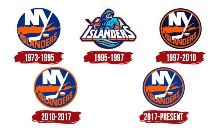
The logo’s story started when publicizing director John Algona of East Meadow employed Jacob Morris Strongin, a visual architect in Syosset, California. He moved him to make an excellent logo for the New York Islanders. The cooperation brought about an adaptation with the truncation “NY” and the engraving “Islanders” on the foundation of the regulatory guide of Long Island, Nassau, and Suffolk.
1973 – 1995
Beginning around 1973, the New York Islanders have changed their logo multiple times. The principal shading plan joined blue, orange, and white. The first and the last two symbols didn’t vary much from one another, yet the 1996-1997 season logo was a finished difference; it was the most noticeably awful move the Islanders the board bunch has ever had.
1995 – 1997
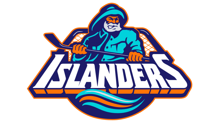
Before beginning the new NHL season, the possession endeavored to give the Isles a new look. The past logo was supplanted by one, including a fisher in an overcoat and cap. He grasped a blue hockey stick, remaining before a red-and-blue hockey objective. The angler delegated the white-prearranged word “Islanders,” illustrated with orange and blue tones. The wordmark was washed by orange and two blue waves. This New York Islanders logo was the most exceedingly terrible in the group history, making the Islanders a total NHL joke.
1997 – 2010
The old logo was reestablished in the 1998 season. The proprietorship persuaded that they had committed an immense error and misconstrued the hidden energy of the fans. As a rule, the Islanders were quick to understand that dapper the 90s was a severe mix-up. They rapidly “suffocated” the angler and got back to the excellent logo, substituting the shading plan with a hazier one. In this way, regal blue was changed to naval force blue. The emblem was surrounded in dazzling orange. The drawing of the island was improved too. The letters “NY,” the hockey stick, and the picture of Long Island stayed unaltered.
2010 – 2017
The penultimate Islanders logo was presented eight years prior, in 2011. It consolidates the elements of the first and past logos. It is planned in illustrious blue once more. Moreover, on the “Y,” there are currently four stripes rather than three. The importance? Four Stanley Cups, the Islanders won.
2017 – present

The cutting-edge variety is very nearly precise of the past logo. It holds a similar construction. The format of the components is indistinguishable: a guide with capital letters from the name of New York behind the scenes. Additionally, “Y” is supplanted by an adapted game stay with four orange stripes – as indicated by the number of triumphs in the Stanley Cup won in 1980. To one side of it is a hockey puck.
The following is “Islanders.” The highest point of the “I” shows the Uniondale of Nassau County, where its home arena is found. To do this, the upper quarter of the capital letter is painted in a differentiating blue tone to notice the fact on the guide. The main distinction from the past variant is the shading plan, which has turned somewhat muffled.
Logos related to New York Islanders from the Sports Industry
Frequently Asked Questions (FAQ) about the New York Islanders Logo
The New York Islanders logo is one of the NHL logos and is an example of the sports industry logo from United States. According to our data, the New York Islanders logotype was designed for the sports industry. You can learn more about the New York Islanders brand on the nhl.com/islanders website.
Most logos are distributed vector-based. There are several vector-based file formats, such as EPS, PDF, and SVG. Simple images such as logos will generally have a smaller file size than their rasterized JPG, PNG, or GIF equivalent. You can read more about Raster vs Vector on the vector-conversions.com.
SVG or Scalable Vector Graphics is an XML-style markup-driven vector graphic rendering engine for the browser. Generally speaking, SVG offers a way to do full resolution graphical elements, no matter what size screen, what zoom level, or what resolution your user's device has.
There are several reasons why SVG is smart to store logo assets on your website or use it for print and paper collateral. Benefits including small file size, vector accuracy, W3C standards, and unlimited image scaling. Another benefit is compatibility — even if the facilities offered by SVG rendering engines may differ, the format is backward and forward compatible. SVG engines will render what they can and ignore the rest.
Having the New York Islanders logo as an SVG document, you can drop it anywhere, scaling on the fly to whatever size it needs to be without incurring pixelation and loss of detail or taking up too much bandwidth.
Since the New York Islanders presented as a vector file and SVG isn’t a bitmap image, it is easily modified using JavaScript, CSS, and graphic editors. That makes it simple to have a base SVG file and repurpose it in multiple locations on the site with a different treatment. SVG XML code can be created, verified, manipulated, and compressed using various tools from code editors like Microsoft VS Code or Sublime Text to graphic editors such as Figma, Affinity Designer, ADOBE Illustrator, and Sketch.
You can download the New York Islanders logotype in vector-based SVG (Scalable Vector Graphics) file format on this web page.
According to wikipedia.org: "A logo (an abbreviation of logotype, from Greek: λόγος, romanized: logos, lit. 'word' and Greek: τύπος, romanized: typos, lit. 'imprint') is a graphic mark, emblem, or symbol used to aid and promote public identification and recognition. It may be of an abstract or figurative design or include the text of the name it represents as in a wordmark."
Logos fall into three classifications (which can be combined). Ideographs are abstract forms; pictographs are iconic, representational designs; Logotypes (or Wordmarks) depict the name or company's initials. Because logos are meant to represent companies brands or corporate identities and foster their immediate customer recognition, it is counterproductive to redesign logos frequently.
A logo is the central element of a complex identification system that must be functionally extended to an organization's communications. Therefore, the design of logos and their incorporation into a visual identity system is one of the most challenging and essential graphic design areas.
As a general rule, third parties may not use the New York Islanders logo without permission given by the logo and (or) trademark owner NHL. For any questions about the legal use of the logo, please contact the NHL directly. You can find contact information on the website nhl.com/islanders.
We strive to find official logotypes and brand colors, including the New York Islanders logo, from open sources, such as wikipedia.org, seeklogo.com, brandsoftheworld.com, famouslogos.net, and other websites; however, we cannot guarantee the New York Islanders logo on this web page is accurate, official or up-to-date. To get the official New York Islanders logo, please get in touch with the NHL directly or go to nhl.com/islanders.
By downloading the New York Islanders logo from the Logotyp.us website, you agree that the logo provided "as-is." All the materials appearing on the Logotyp.us website (including company names, logotypes, brand names, brand colors, and website URLs) could include technical, typographical, or photographic errors or typos.
We do not claim any rights to the New York Islanders logo and provide the logo for informational and non-commercial purposes only. You may not use or register, or otherwise claim ownership in any New York Islanders trademark, including as or as part of any trademark, service mark, company name, trade name, username, or domain registration. You do not suppose to share a link to this web page as the source of the "official New York Islanders logo" Thank you.
The color orange is a warm, vibrant color that is often associated with energy, cheerfulness, and happiness. It is a combination of red and yellow, and is often seen as a cheerful, energetic color. In design, orange is often used to add a pop of color to a space and can be used to create a warm, welcoming atmosphere. In fashion, orange is often used to add a touch of fun and playfulness to an outfit. The color orange is also often associated with autumn, as it is often seen in the leaves of deciduous trees during the fall season. Blue is a color that is often described as cool, calming, and serene. It is typically associated with the sky and the ocean, and is often used to evoke feelings of tranquility and peacefulness. In terms of its visual appearance, blue is a primary color that is located on the opposite end of the spectrum from red. It is often described as a cool color, as it tends to recede and appear farther away than warm colors such as red, orange, and yellow. Blue is also often described as a soothing and relaxing color, and is often used in hospitals and other healthcare settings to promote a sense of calm and well-being. Blue is a popular color that is often used in fashion, design, and marketing. It is often paired with other colors to create a range of effects, and can be used to create a sense of contrast or to create a cohesive look. Blue is also a popular color for logos, branding, and other visual identity elements, as it is often associated with trustworthiness, reliability, and intelligence.
It's important to note that these associations are not universal, and different people may have different emotional responses to colors.

