SAP SE
SAP logo preview
Learn more about SAP, find out the SAP SE brand colors, and download SAP vector logo in the SVG file format. Find related logos. Looking for a raster logo? Here you can download PNG SAP logo on a transparent background as well.
SAP SE is a German multinational software corporation that makes enterprise software to manage business operations and customer relations. SAP is headquartered in Walldorf, Baden-Württemberg, Germany with regional offices in 180 countries. The company has over 425,000 customers in over 180 countries and is a component of the Euro Stoxx 50 stock market index.

Subtle enhancements to the SAP logo make it feel more contemporary. Designed to live in the digital world, the new mark springs vividly from the screen, on any background, connecting with both large-scale business clients and individual consumers.

SAP Logo
The SAP logo has been changed a few times all through its over 45-year history. Notwithstanding, the general look of the seal has not changed much as its middle has consistently been the three-letter wordmark.
Meaning and history
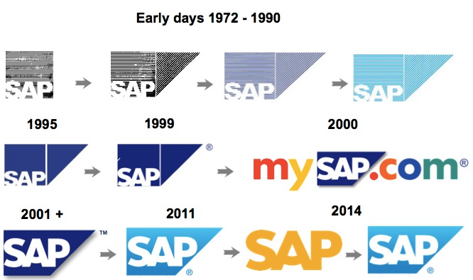
SAP made its initial phases in 1972, beginning with one client and under ten representatives. Today, it has more than 340,000 clients in more than 180 nations. The early forms of the token highlighted only the name of the organization in a square shape.

2000 — 2011
It was distinctly in 1999 that the triangle was added to the image. For two or three years, the organization tried different things with the tones, for the most part, shades of blue. One more noteworthy change was the presentation of a “smiling” “A.”
2011 — Today
In 2011 the organization embraced the rendition of the logo with the light blue foundation. One day in late October 2014, guests of the organization’s true web asset saw an unprecedented change. The famous blue logo went gold. The bright, hopeful shading made an ideal congruity with the grinning “A.” In any case, that was not all. Gone were the natural square and triangle shapes. This form of the logo was a plain gold wordmark given against the white foundation. Then again, the logo could be switched. For this situation, the foundation was gold, while the actual letters were white. The turned-around adaptation was put into a square shape.
Albeit the gold rendition made a well disposed and hopeful impression, the organization disposed of it very soon. All things being equal, it got back to the norm, in a split second conspicuous adaptation of the logo, where the white letters were put inside a blue shape framed by a square and a triangle.

The "SAP SE" appears in: Software
Siegel + Gale Agency Logos:
Logos related to SAP from the Software Industry
Frequently Asked Questions (FAQ) about the SAP Logo
The SAP logo is an example of the software industry logo from Germany. According to our data, the SAP SE logotype was designed in 2011 in the Siegel + Gale agency. You can learn more about the SAP brand on the sap.com website.
Most logos are distributed vector-based. There are several vector-based file formats, such as EPS, PDF, and SVG. Simple images such as logos will generally have a smaller file size than their rasterized JPG, PNG, or GIF equivalent. You can read more about Raster vs Vector on the vector-conversions.com.
SVG or Scalable Vector Graphics is an XML-style markup-driven vector graphic rendering engine for the browser. Generally speaking, SVG offers a way to do full resolution graphical elements, no matter what size screen, what zoom level, or what resolution your user's device has.
There are several reasons why SVG is smart to store logo assets on your website or use it for print and paper collateral. Benefits including small file size, vector accuracy, W3C standards, and unlimited image scaling. Another benefit is compatibility — even if the facilities offered by SVG rendering engines may differ, the format is backward and forward compatible. SVG engines will render what they can and ignore the rest.
Having the SAP logo as an SVG document, you can drop it anywhere, scaling on the fly to whatever size it needs to be without incurring pixelation and loss of detail or taking up too much bandwidth.
Since the SAP presented as a vector file and SVG isn’t a bitmap image, it is easily modified using JavaScript, CSS, and graphic editors. That makes it simple to have a base SVG file and repurpose it in multiple locations on the site with a different treatment. SVG XML code can be created, verified, manipulated, and compressed using various tools from code editors like Microsoft VS Code or Sublime Text to graphic editors such as Figma, Affinity Designer, ADOBE Illustrator, and Sketch.
You can download the SAP logotype in vector-based SVG (Scalable Vector Graphics) file format on this web page.
According to wikipedia.org: "A logo (an abbreviation of logotype, from Greek: λόγος, romanized: logos, lit. 'word' and Greek: τύπος, romanized: typos, lit. 'imprint') is a graphic mark, emblem, or symbol used to aid and promote public identification and recognition. It may be of an abstract or figurative design or include the text of the name it represents as in a wordmark."
Logos fall into three classifications (which can be combined). Ideographs are abstract forms; pictographs are iconic, representational designs; Logotypes (or Wordmarks) depict the name or company's initials. Because logos are meant to represent companies brands or corporate identities and foster their immediate customer recognition, it is counterproductive to redesign logos frequently.
A logo is the central element of a complex identification system that must be functionally extended to an organization's communications. Therefore, the design of logos and their incorporation into a visual identity system is one of the most challenging and essential graphic design areas.
As a general rule, third parties may not use the SAP logo without permission given by the logo and (or) trademark owner. For any questions about the legal use of the logo, please contact SAP directly. You can find contact information on the website sap.com.
We strive to find official logotypes and brand colors, including the SAP logo, from open sources, such as wikipedia.org, seeklogo.com, brandsoftheworld.com, famouslogos.net, and other websites; however, we cannot guarantee the SAP logo on this web page is accurate, official or up-to-date. To get the official SAP logo, please get in touch with SAP directly or go to sap.com.
By downloading the SAP logo from the Logotyp.us website, you agree that the logo provided "as-is." All the materials appearing on the Logotyp.us website (including company names, logotypes, brand names, brand colors, and website URLs) could include technical, typographical, or photographic errors or typos.
We do not claim any rights to the SAP logo and provide the logo for informational and non-commercial purposes only. You may not use or register, or otherwise claim ownership in any SAP trademark, including as or as part of any trademark, service mark, company name, trade name, username, or domain registration. You do not suppose to share a link to this web page as the source of the "official SAP logo" or "official SAP SE logo." Thank you.
Blue is a color that is often described as cool, calming, and serene. It is typically associated with the sky and the ocean, and is often used to evoke feelings of tranquility and peacefulness. In terms of its visual appearance, blue is a primary color that is located on the opposite end of the spectrum from red. It is often described as a cool color, as it tends to recede and appear farther away than warm colors such as red, orange, and yellow. Blue is also often described as a soothing and relaxing color, and is often used in hospitals and other healthcare settings to promote a sense of calm and well-being. Blue is a popular color that is often used in fashion, design, and marketing. It is often paired with other colors to create a range of effects, and can be used to create a sense of contrast or to create a cohesive look. Blue is also a popular color for logos, branding, and other visual identity elements, as it is often associated with trustworthiness, reliability, and intelligence.
It's important to note that these associations are not universal, and different people may have different emotional responses to colors.

