Buffalo Sabres
Buffalo Sabres logo preview
Learn more about Buffalo Sabres, find out the Buffalo Sabres brand colors, and download Buffalo Sabres vector logo in the SVG file format. Find related logos. Looking for a raster logo? Here you can download PNG Buffalo Sabres logo on a transparent background as well.
Brand information
| Website | Buffalo Sabres |
| Country | United States |
| Industry | Sports |
| Rating | 97/100 (70 votes) |
| Updated | Jun 11, 2024 |
The Buffalo Sabres logo features yellow blue colors
This is a color scheme of Buffalo Sabres. You can copy each of the logo colors by clicking on a button with the color HEX code above.
NHL logos
The Buffalo Sabres are a professional ice hockey team based in Buffalo, New York. They are members of the Atlantic Division of the Eastern Conference of the National Hockey League (NHL). The team was established in 1970, along with the Vancouver Canucks, when the league expanded to 14 teams. They have played at KeyBank Center since 1996. Prior to that, the Buffalo Sabres played at the Buffalo Memorial Auditorium from the start of the franchise in 1970. The Sabres are owned by Terry Pegula, who purchased the club in 2011.

The Buffalo Sabers ice hockey group showed up in 1970 when the NHL chose to extend the League’s best 14 establishments. The Buffalo Sabers was established by the Knox siblings, Seymour and Northup, in 1970. The group is situated in Buffalo, New York, USA.
The Knox siblings declared the name-the-group challenge to obtain a more unique and memorable name for the establishment. Numerous thoughts were submitted with words like “Mugwumps,” “Humming Bees,” “Wild ox Bison,” “Flying Zeppelins,” “Wild ox Bulls,” and so on being recommended. In any case, the siblings imagined that such names were excessively plain and unsophisticated for Buffalo-based groups. Also, wild ox, buffalo, and bull allude to enormous, even-ungulate creatures in Bison’s variety. At long last, Sabers won out. The proprietors guaranteed they preferred Sabers as it is a viable weapon in both offense and safeguard, so they trusted their group would be. At any rate, “Bulls,” “Buffaloes,” and “Wild oxen” are group monikers, as the Buffalo Sabers logo includes a bison over two crossed sabers.
In the spring of 1996, passed on the Buffalo Sabers’ vital proprietor Seymour Knox III. In the 1996-97 season, the group changed its fundamental tones from blue and gold to dark and red. That same year the Buffalo Sabers moved from Memorial Auditorium to the new HSBC Arena.
Sabretooth, a human saber-toothed tiger, is the mascot of the Buffalo Sabers.
Meaning and History

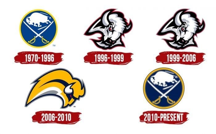
Although there is no text on the Buffalo Sabers logo, it mirrors the group’s actual name and the club’s location. The emblem comprises two sections as though it were two words. The first indicates the aggregate picture of “wild ox, bull, buffalo” – a delegate of an enormous artiodactyl. The second pass on the skates’ sharpness on which the hockey players go out on the ice, so sabers are deliberate, striking second, mobility. Albeit every one of the symbols shows just two items, they vary from one another. Altogether, the establishment has changed five options.
1970 - 1996

Since it is assumed that the city was named after the American bison that once meandered the province of New York in tremendous groups, precisely this monster was picked to be attracted the primary Buffalo Sabers logo. The first logo was a blue circle with a yellow layout. It contained two crossed sabers with yellow handles and a running white wild ox between them.
1996 – 1999

In the 1990s, the group presented another logo and shading plan. The Buffalo Sabers created some distance from a blue and yellow examine favor of dark, red, and silver. The sabers in the logo were taken out and supplanted with the top of a bison with red eyes. This silver-and-dark wild ox with a red framework was Sabers logo until 2006.
1999 – 2006

The Sabers logo again went through a slight overhaul. The fourth logo had a superior shading quality and improved graphics.
2006 - 2010

The 2007 re-visitation of the first blue and yellow shading plan was a decent call. However, the plan was perceived as one of the most exceedingly awful logos in sports history. The Buffaslug logo highlighted yellow bison with white horns and dazzling red eyes. The creature was portrayed in profile, which assisted with making the impact of a similar running bison.
2010 – present

The current Sabers logo tosses back to the 1970 unique look; however, it accompanies a couple of changes, as further developed illustrations and some contemporary subtleties. The current individual distinguishing proof imprint is a further developed adaptation of the introduction logo. After a progression of changes attempted, the group’s administration reasoned that the best imagery is the first. Accordingly, the group returned it in 2010 and has never transformed it since. All components are presently upgraded with slim shape lines that make the drawing exact and centered.
The bull looks inconceivably imposing, albeit the fashioners have eliminated the radiant red-eye tone, supplanting it with a dull shade. The creature is as yet portrayed assaulting from the left. Two encompassing strokes prove that the cloven-hoofed creature is quickly flying forward. Because of the edging, the sabers have additionally become substantially more expressive.
Logos related to Buffalo Sabres from the Sports Industry
Frequently Asked Questions (FAQ) about the Buffalo Sabres Logo
The Buffalo Sabres logo is one of the NHL logos and is an example of the sports industry logo from United States. According to our data, the Buffalo Sabres logotype was designed for the sports industry. You can learn more about the Buffalo Sabres brand on the nhl.com/sabres website.
Most logos are distributed vector-based. There are several vector-based file formats, such as EPS, PDF, and SVG. Simple images such as logos will generally have a smaller file size than their rasterized JPG, PNG, or GIF equivalent. You can read more about Raster vs Vector on the vector-conversions.com.
SVG or Scalable Vector Graphics is an XML-style markup-driven vector graphic rendering engine for the browser. Generally speaking, SVG offers a way to do full resolution graphical elements, no matter what size screen, what zoom level, or what resolution your user's device has.
There are several reasons why SVG is smart to store logo assets on your website or use it for print and paper collateral. Benefits including small file size, vector accuracy, W3C standards, and unlimited image scaling. Another benefit is compatibility — even if the facilities offered by SVG rendering engines may differ, the format is backward and forward compatible. SVG engines will render what they can and ignore the rest.
Having the Buffalo Sabres logo as an SVG document, you can drop it anywhere, scaling on the fly to whatever size it needs to be without incurring pixelation and loss of detail or taking up too much bandwidth.
Since the Buffalo Sabres presented as a vector file and SVG isn’t a bitmap image, it is easily modified using JavaScript, CSS, and graphic editors. That makes it simple to have a base SVG file and repurpose it in multiple locations on the site with a different treatment. SVG XML code can be created, verified, manipulated, and compressed using various tools from code editors like Microsoft VS Code or Sublime Text to graphic editors such as Figma, Affinity Designer, ADOBE Illustrator, and Sketch.
You can download the Buffalo Sabres logotype in vector-based SVG (Scalable Vector Graphics) file format on this web page.
According to wikipedia.org: "A logo (an abbreviation of logotype, from Greek: λόγος, romanized: logos, lit. 'word' and Greek: τύπος, romanized: typos, lit. 'imprint') is a graphic mark, emblem, or symbol used to aid and promote public identification and recognition. It may be of an abstract or figurative design or include the text of the name it represents as in a wordmark."
Logos fall into three classifications (which can be combined). Ideographs are abstract forms; pictographs are iconic, representational designs; Logotypes (or Wordmarks) depict the name or company's initials. Because logos are meant to represent companies brands or corporate identities and foster their immediate customer recognition, it is counterproductive to redesign logos frequently.
A logo is the central element of a complex identification system that must be functionally extended to an organization's communications. Therefore, the design of logos and their incorporation into a visual identity system is one of the most challenging and essential graphic design areas.
As a general rule, third parties may not use the Buffalo Sabres logo without permission given by the logo and (or) trademark owner NHL. For any questions about the legal use of the logo, please contact the NHL directly. You can find contact information on the website nhl.com/sabres.
We strive to find official logotypes and brand colors, including the Buffalo Sabres logo, from open sources, such as wikipedia.org, seeklogo.com, brandsoftheworld.com, famouslogos.net, and other websites; however, we cannot guarantee the Buffalo Sabres logo on this web page is accurate, official or up-to-date. To get the official Buffalo Sabres logo, please get in touch with the NHL directly or go to nhl.com/sabres.
By downloading the Buffalo Sabres logo from the Logotyp.us website, you agree that the logo provided "as-is." All the materials appearing on the Logotyp.us website (including company names, logotypes, brand names, brand colors, and website URLs) could include technical, typographical, or photographic errors or typos.
We do not claim any rights to the Buffalo Sabres logo and provide the logo for informational and non-commercial purposes only. You may not use or register, or otherwise claim ownership in any Buffalo Sabres trademark, including as or as part of any trademark, service mark, company name, trade name, username, or domain registration. You do not suppose to share a link to this web page as the source of the "official Buffalo Sabres logo" Thank you.
The color yellow is a bright, cheerful color that is often associated with happiness, optimism, and sunshine. It is a warm color that is often used to create a happy and welcoming atmosphere. In design, yellow is often used to add a touch of cheerfulness and brightness to a space. In fashion, yellow is often used to add a pop of color to an outfit and can be used to create a playful, energetic look. The color yellow is also often associated with caution and warning, as it is the color of many traffic signs and warning lights. Blue is a color that is often described as cool, calming, and serene. It is typically associated with the sky and the ocean, and is often used to evoke feelings of tranquility and peacefulness. In terms of its visual appearance, blue is a primary color that is located on the opposite end of the spectrum from red. It is often described as a cool color, as it tends to recede and appear farther away than warm colors such as red, orange, and yellow. Blue is also often described as a soothing and relaxing color, and is often used in hospitals and other healthcare settings to promote a sense of calm and well-being. Blue is a popular color that is often used in fashion, design, and marketing. It is often paired with other colors to create a range of effects, and can be used to create a sense of contrast or to create a cohesive look. Blue is also a popular color for logos, branding, and other visual identity elements, as it is often associated with trustworthiness, reliability, and intelligence.
It's important to note that these associations are not universal, and different people may have different emotional responses to colors.

