Boston Bruins
Boston Bruins logo preview
Learn more about Boston Bruins, find out the Boston Bruins brand colors, and download Boston Bruins vector logo in the SVG file format. Find related logos. Looking for a raster logo? Here you can download PNG Boston Bruins logo on a transparent background as well.
Brand information
| Website | Boston Bruins |
| Country | United States |
| Industry | Sports |
| Rating | 96/100 (69 votes) |
| Updated | Jun 11, 2024 |
The Boston Bruins logo features yellow black colors
This is a color scheme of Boston Bruins. You can copy each of the logo colors by clicking on a button with the color HEX code above.
NHL logos
The Boston Bruins are a professional ice hockey team based in Boston. They are members of the Atlantic Division of the Eastern Conference of the National Hockey League (NHL). The team has been in existence since 1924, and is the league’s third-oldest team overall and the oldest in the United States. It is also an Original Six franchise, along with the Chicago Blackhawks, Detroit Red Wings, Montreal Canadiens, New York Rangers and Toronto Maple Leafs. The Bruins have won six Stanley Cup championships, tied for fourth most of all-time with the Blackhawks and tied second-most of any American NHL team also with the Blackhawks (behind the Red Wings, who have 11)
The Boston Bruins are an ice hockey group situated in Boston, Massachusetts. The establishment was established in 1924. Nowadays, it is the NHL’s third-most established group and the most seasoned in the USA.
Charles Adams, the proprietor of the supermarket chain in Boston, turned into an enthusiastic hockey fan after watching the 1924 Stanley Cup. He was igniting with a longing to carry his expert hockey group to Boston. Luckily, Adams figured out how to persuade the NHL authorities to grow the League and acknowledge a group from the United States. On November 1, 1924, the Boston Bruins joined the National Hockey League. The Canadian expert hockey player Art Ross was named as a head supervisor and mentor of the group. The Bruins’ proprietor, tycoon Charles Adams met him during the outing to Canada looking for players.
Regarding a gathering of groups called the Original Six, different preferences will generally blur out of the spotlight. The Boston Bruins is the third A-rundown hockey club after the Montreal Canadiens and Toronto Maple Leafs to keep up with its NHL status. Their establishment denoted a significant defining moment throughout the entire existence of hockey in North America. For sure, the League, which started play with groups in Ontario and Quebec, set out on fast extension to the USA.
Establishment proprietor Charles Adams focused on presenting a yellow and earthy colored shading range coordinating with the shades of his staple chain. He wished it to imply the force and strength of “Boston.” Thus, Charles Adams decided to hold a name-the-group challenge. One of the recently settled group fans thought about the “Bears” epithet since it is impeccably identified with “untamed creature typified with size, strength, dexterity, savagery and shrewd, while likewise in the earthy colored shading class.” Adams appreciated this thought; at this point, he chose to name the group “Bruins,” the word recognizing a bear began from the archaic English fantasies and old stories.
Meaning and History
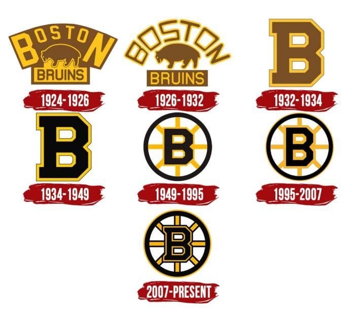
The Boston Bruins are probably the most seasoned establishment in ice hockey history. The NHL group entered the 1924-25 season with a brown and yellow logo, including a bear. The seven Boston Bruins logos appear to be unique from the beginning. However, you will see many likenesses in shading on the off chance that you look carefully. The earthy colored range is available in all variations but with slight shades. The essential decision of the hockey club promptly fell on the earthy colored bear. Different clarifications identify with the creature’s qualities: it is strong, incredible, astounding assaulting, impressive, and gallant. The Bruins spent numerous years adjusting their logo. They worked effectively, as even the slightest change was a monster advantage. Incidentally, the circle steers clear of the wheel. It infers that Boston is the genuine focus of America, and all streets lead there.
1924 – 1926
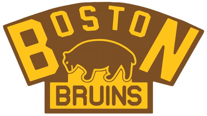
The first Boston Bruins image highlighted an earthy colored bear waiting to pounce encompassed by a yellow-prearranged “Boston” wordmark. The monster appeared to stroll on the brown-prearranged “Bruins” on a yellow foundation.
1926 - 1932
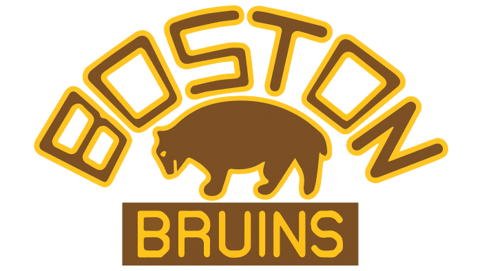
The reason for the subsequent logo was the debut one, at this point with minor changes. The earthy-colored bear was as yet in the middle. The text style of “Boston” and “Bruins” wordmarks were changed. However, they were as yet in an alternate text style. The yellow components of the past logo were changed to brown as well as the other way around. The foundation was taken out. The logo strokes a decent harmony among pictures and text. It was likewise this logo that observed Boston’s first Stanley Cup in 1929.
1923 - 1934

During the 1930s, the establishment retired its bear-enhanced logo and went with a blocky brown “B” with a thick yellow blueprint as the logo. It was an incredibly moderate logo. Coincidentally, no one knows what “B” represented: Boston or Bruins or the two of them.
1934 – 1949

Blocky yellow-laid out “B” stayed unaltered. However, its fundamental tone was changed from brown to dark.
1949 – 1995

The center point and-talked plan of the Boston Bruins logo went on for a considerable length of time. The dark “B” with a yellow framework was set inside a dark circle with eight yellow spokes. It was a generally basic plan, no doubt. Be that as it may, the process represented Boston as the significant transportation center point and focus where all streets lead. Accordingly, this wheel went through a few changes until it took an advanced shape.
1995 – 2007
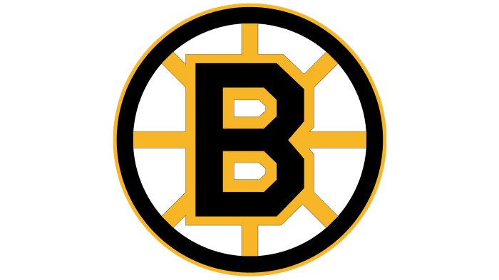
In 1996, the Boston Bruins logo was marginally refreshed. The “B” was somewhat taller, all the more intently looking like the text style utilized in the first B-logo. The letter looked more contemporary and perfect—most perceptible a significant trend dark trim accents around the B, the spokes, and the boundary. A slim yellow layout showed up around the dark circle.
2007 – present
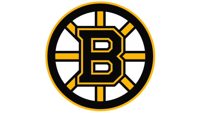
2008 presented the Reebok Edge shirts. With the new duds came more changes to the logo. Its plan consolidates the 1996 and 1933 logos. It includes a more modest “B” with a heap of thicker dark accents, giving the current logo a more voluminous yet forceful appearance. The dark blueprint of the spokes has become broader, just as the external yellow line. The spokes are balanced now.
Logos related to Boston Bruins from the Sports Industry
Frequently Asked Questions (FAQ) about the Boston Bruins Logo
The Boston Bruins logo is one of the NHL logos and is an example of the sports industry logo from United States. According to our data, the Boston Bruins logotype was designed for the sports industry. You can learn more about the Boston Bruins brand on the nhl.com/bruins website.
Most logos are distributed vector-based. There are several vector-based file formats, such as EPS, PDF, and SVG. Simple images such as logos will generally have a smaller file size than their rasterized JPG, PNG, or GIF equivalent. You can read more about Raster vs Vector on the vector-conversions.com.
SVG or Scalable Vector Graphics is an XML-style markup-driven vector graphic rendering engine for the browser. Generally speaking, SVG offers a way to do full resolution graphical elements, no matter what size screen, what zoom level, or what resolution your user's device has.
There are several reasons why SVG is smart to store logo assets on your website or use it for print and paper collateral. Benefits including small file size, vector accuracy, W3C standards, and unlimited image scaling. Another benefit is compatibility — even if the facilities offered by SVG rendering engines may differ, the format is backward and forward compatible. SVG engines will render what they can and ignore the rest.
Having the Boston Bruins logo as an SVG document, you can drop it anywhere, scaling on the fly to whatever size it needs to be without incurring pixelation and loss of detail or taking up too much bandwidth.
Since the Boston Bruins presented as a vector file and SVG isn’t a bitmap image, it is easily modified using JavaScript, CSS, and graphic editors. That makes it simple to have a base SVG file and repurpose it in multiple locations on the site with a different treatment. SVG XML code can be created, verified, manipulated, and compressed using various tools from code editors like Microsoft VS Code or Sublime Text to graphic editors such as Figma, Affinity Designer, ADOBE Illustrator, and Sketch.
You can download the Boston Bruins logotype in vector-based SVG (Scalable Vector Graphics) file format on this web page.
According to wikipedia.org: "A logo (an abbreviation of logotype, from Greek: λόγος, romanized: logos, lit. 'word' and Greek: τύπος, romanized: typos, lit. 'imprint') is a graphic mark, emblem, or symbol used to aid and promote public identification and recognition. It may be of an abstract or figurative design or include the text of the name it represents as in a wordmark."
Logos fall into three classifications (which can be combined). Ideographs are abstract forms; pictographs are iconic, representational designs; Logotypes (or Wordmarks) depict the name or company's initials. Because logos are meant to represent companies brands or corporate identities and foster their immediate customer recognition, it is counterproductive to redesign logos frequently.
A logo is the central element of a complex identification system that must be functionally extended to an organization's communications. Therefore, the design of logos and their incorporation into a visual identity system is one of the most challenging and essential graphic design areas.
As a general rule, third parties may not use the Boston Bruins logo without permission given by the logo and (or) trademark owner NHL. For any questions about the legal use of the logo, please contact the NHL directly. You can find contact information on the website nhl.com/bruins.
We strive to find official logotypes and brand colors, including the Boston Bruins logo, from open sources, such as wikipedia.org, seeklogo.com, brandsoftheworld.com, famouslogos.net, and other websites; however, we cannot guarantee the Boston Bruins logo on this web page is accurate, official or up-to-date. To get the official Boston Bruins logo, please get in touch with the NHL directly or go to nhl.com/bruins.
By downloading the Boston Bruins logo from the Logotyp.us website, you agree that the logo provided "as-is." All the materials appearing on the Logotyp.us website (including company names, logotypes, brand names, brand colors, and website URLs) could include technical, typographical, or photographic errors or typos.
We do not claim any rights to the Boston Bruins logo and provide the logo for informational and non-commercial purposes only. You may not use or register, or otherwise claim ownership in any Boston Bruins trademark, including as or as part of any trademark, service mark, company name, trade name, username, or domain registration. You do not suppose to share a link to this web page as the source of the "official Boston Bruins logo" Thank you.
The color black is a neutral color that is often associated with sophistication, elegance, and power. It is a strong, bold color that is often used to create a dramatic visual impact. In design, black is often used to create a sleek, modern look, and it is also often used to represent sophistication and luxury. In fashion, black is often used to create a sleek, classic look, and it is also often associated with formality and evening wear. The color black is also often associated with mystery, darkness, and the unknown. The color yellow is a bright, cheerful color that is often associated with happiness, optimism, and sunshine. It is a warm color that is often used to create a happy and welcoming atmosphere. In design, yellow is often used to add a touch of cheerfulness and brightness to a space. In fashion, yellow is often used to add a pop of color to an outfit and can be used to create a playful, energetic look. The color yellow is also often associated with caution and warning, as it is the color of many traffic signs and warning lights.
It's important to note that these associations are not universal, and different people may have different emotional responses to colors.

