Chicago Blackhawks
Chicago Blackhawks logo preview
Learn more about Chicago Blackhawks, find out the Chicago Blackhawks brand colors, and download Chicago Blackhawks vector logo in the SVG file format. Find related logos. Looking for a raster logo? Here you can download PNG Chicago Blackhawks logo on a transparent background as well.
Brand information
| Website | Chicago Blackhawks |
| Country | United States |
| Industry | Sports |
| Rating | 89/100 (14 votes) |
| Updated | Jun 11, 2024 |
The Chicago Blackhawks logo features brown black yellow red green colors
This is a color scheme of Chicago Blackhawks. You can copy each of the logo colors by clicking on a button with the color HEX code above.
NHL logos
The Chicago Blackhawks (spelled Black Hawks until 1986, and known colloquially as the Hawks) are a professional ice hockey team based in Chicago, Illinois. They are members of the Central Division of the Western Conference of the National Hockey League (NHL). They have won six Stanley Cup championships since their founding in 1926. The Blackhawks are one of the “Original Six” NHL teams along with the Detroit Red Wings, Montreal Canadiens, Toronto Maple Leafs, Boston Bruins and New York Rangers. Since 1994, the club’s home rink is the United Center, which they share with the National Basketball Association’s Chicago Bulls. The club had previously played for 65 years at Chicago Stadium.
The Chicago Blackhawks, one of the “First Six” NHL groups, is situated in Chicago, Illinois. The group contends in the Central Division of the Western Conference of the League. Its experiences return to 1926 when the Western Canada Hockey League imploded because of the monetary issues and expanding NHL contest. WCHL originators Frank and Lester Patrick needed to offer players and whole groups to their more extravagant NHL adversaries to remain above water. They called Chicago espresso investor Frederic McLaughlin to organize the acquisition of Portland Rosebuds. McLaughlin himself was a games fan. However, he liked undeniably more blue-blooded sorts of game. He was a top-notch horse-rider and an exceptionally well-known polo player, so he enjoyed the thought. A gathering of investors headed by McLaughlin figured out how to pay Patrick $ 200,000 to move the Rosebuds to Chicago.
The group in the City of the Winds could be called neither buds nor roses nor blends of these words. Significant Frederick McLaughlin was an authority with the Blackhawk Division during World War I, so he didn’t contemplate his new club’s name. In addition, McLaughlin adored his local land and knew its set of experiences. He knew that the nineteenth-century Midwest (remembering for Illinois, where Chicago is found) was tormented by ridiculous conflicts between the settlers and the Native Americans. One of the unbelievable figures of Indian wars was the head of the Black Hawk clan. That is why the Chicago club logo doesn’t portray a falcon, yet the Indian’s head has been amusing since the establishment.
Until 1986 the group name was spelled Black Hawks. However, presently it is spelled as Blackhawks.
Meaning and History
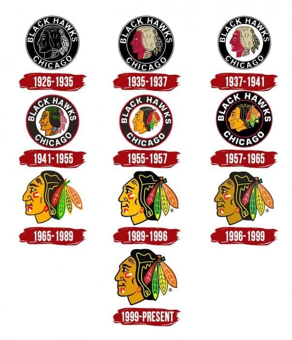
Albeit the group has countless logos (there are ten), this doesn’t imply that they are unique about one another. No, the historical backdrop of the Chicago Blackhawks logo is the development of one adaptation in various “faces” because the primary component is the local American country of the Black Hawk country. This idea was proposed by Irene Castle, spouse of an espresso tycoon and first establishment proprietor Frederic McLaughlin.
In 2008, the Chicago Blackhawks logo was perceived as the most incredible in the NHL, as indicated by a test of the League’s fans. “It is the truly conspicuous image, which conveys a special message and motivates adversaries to incalculable impersonations. The surveying coordinators said that the logo gives the sensation of pride and obligation towards him and looks extraordinary on a T-shirt and a baseball cap”, the surveying coordinators said.
The distinctive shading showed up in the logo in 1935. The pioneer’s face was painted red. However, later, it was considered mistaken regarding the Indians, and in 1941, architects made the skin brown.
Yet, some Native Americans don’t endorse this logo and utilizing Indian culture for diversion purposes. Here and there, it causes a genuine embarrassment.
In 1926, the club showed up; the Chicago Blackhawks group logo was made by Irene Castle, the spouse of the group’s originator and espresso magnate Major Frederick McLaughlin.
The legend of the symbol is the tactical head of the Indian Sauk clan. He took an interest in The War of (1812-1815) between the United States, the United Kingdom on the British Empire side. In 1832, he drove the tactical activities of Saukies and Foxes against the United States. The man was an outstanding figure throughout the entire existence of Illinois, where the club is based.
In the first form, the Chicago Blackhawks symbol was highly contrasting and contained an engraving “dark falcons,” which implies the epithet of the group “Chicago Blackhawks.” The name was created by McLaughlin, an administrator of the 333rd assault rifle force of the 86th Division of the US Army during the First World War. Its individuals call themselves “Dark Hawks.”
1926 – 1935
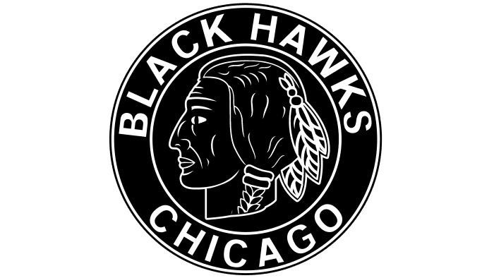
The first Chicago Blackhawks logo was planned by Irene Castle, the spouse of Frederic McLaughlin, the club’s proprietor. It addressed a side perspective on a Native American’s head with three plumes and a twist. The picture was enclosed by the words “Chicago Black Hawks.” The main shadings present in the token were in high contrast.
1935 – 1937
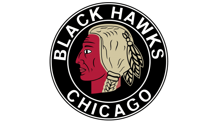
The 1936 logo range remembered two different tones for the option to be highly contrasting. Presently the Indian’s head was red, while his hair was light brown. In any case, the dark circle and white-prearranged name of the group continued as before.
1937 – 1941
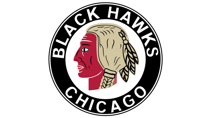
The form disclosed in 1937 looked pretty comparative, aside from the foundation: the dark tone was supplanted by white. The red-skin Indian and the name of the group in a dark foundation were not changed.
1941 – 1955
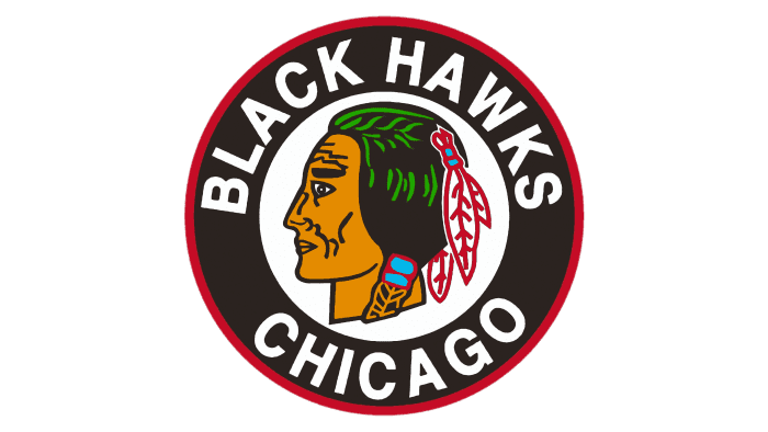
In 1941, the logo was a piece updated, as yet portraying a notable Indian’s head. A more itemized headshot supplanted the contemplative representation. Facial components became milder; red skin became warm yellow and dark hair with slender green lines. There were three red and white quills in his hair. The dark external ring was managed with a slight red framework.
1955 – 1957
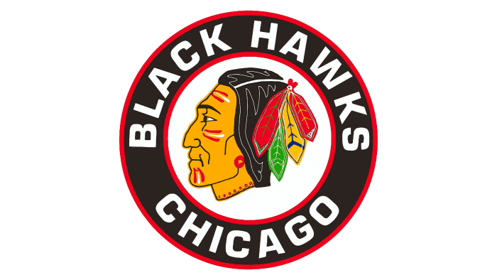
In 1955 a new Chicago Blackhawks logo was introduced. It was a more detailed drawn Indian’s head: the face was decorated with red and white stripes. He was wearing a red earring and four multi-colored feathers in the hair (a green, a yellow, and two red). A white line ran through the hair to make the image voluminous. Two red lines bordered the black ring with the name of the team inside.
1957 – 1965
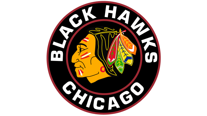
The 6th Chicago Blackhawks token showed minor modifications. The dark ring with the engraving “Dark Hawks Chicago” stayed unaltered. The white lines in the Indian’s hair became yellow. One of the red plumes was changed to orange. Additionally, Native American facial provisions were adjusted once more.
1965 – 1989
One thousand nine hundred sixty-five carried changes to Black Hawk’s head; however, these would suffer for quite some time. The dark roundel was eliminated from the logo, passing on the Indian’s head to fill in as the group peak. The facial elements were milder and less complex; the temple was somewhat lengthened. The representation had a nonpartisan articulation. The red and white stripe on the brow became dark. The given logo would go through just slight changes right up ’til today.
1989 – 1996
1996 – 1999
1999 – present
A sign with a grinning native US agent is currently available for use. It depends on the past form of the more obscure shade. Presently the shadings are brilliant, infectious, expressive. The person has war paint all over, showing that the group is prepared for conclusive activity on the game’s field. There are four multi-hued feathers in the hair. They are integrated and gotten at the rear of the head.
The top of an Indian is displayed in profile and coordinated to one side. Also, in this rendition, it isn’t, however, old as it seemed to be before 1989. Facial components have been somewhat amended, near Caucasoid, so the logo has become substantially more inclusive.
Logos related to Chicago Blackhawks from the Sports Industry
Frequently Asked Questions (FAQ) about the Chicago Blackhawks Logo
The Chicago Blackhawks logo is one of the NHL logos and is an example of the sports industry logo from United States. According to our data, the Chicago Blackhawks logotype was designed for the sports industry. You can learn more about the Chicago Blackhawks brand on the nhl.com/blackhawks website.
Most logos are distributed vector-based. There are several vector-based file formats, such as EPS, PDF, and SVG. Simple images such as logos will generally have a smaller file size than their rasterized JPG, PNG, or GIF equivalent. You can read more about Raster vs Vector on the vector-conversions.com.
SVG or Scalable Vector Graphics is an XML-style markup-driven vector graphic rendering engine for the browser. Generally speaking, SVG offers a way to do full resolution graphical elements, no matter what size screen, what zoom level, or what resolution your user's device has.
There are several reasons why SVG is smart to store logo assets on your website or use it for print and paper collateral. Benefits including small file size, vector accuracy, W3C standards, and unlimited image scaling. Another benefit is compatibility — even if the facilities offered by SVG rendering engines may differ, the format is backward and forward compatible. SVG engines will render what they can and ignore the rest.
Having the Chicago Blackhawks logo as an SVG document, you can drop it anywhere, scaling on the fly to whatever size it needs to be without incurring pixelation and loss of detail or taking up too much bandwidth.
Since the Chicago Blackhawks presented as a vector file and SVG isn’t a bitmap image, it is easily modified using JavaScript, CSS, and graphic editors. That makes it simple to have a base SVG file and repurpose it in multiple locations on the site with a different treatment. SVG XML code can be created, verified, manipulated, and compressed using various tools from code editors like Microsoft VS Code or Sublime Text to graphic editors such as Figma, Affinity Designer, ADOBE Illustrator, and Sketch.
You can download the Chicago Blackhawks logotype in vector-based SVG (Scalable Vector Graphics) file format on this web page.
According to wikipedia.org: "A logo (an abbreviation of logotype, from Greek: λόγος, romanized: logos, lit. 'word' and Greek: τύπος, romanized: typos, lit. 'imprint') is a graphic mark, emblem, or symbol used to aid and promote public identification and recognition. It may be of an abstract or figurative design or include the text of the name it represents as in a wordmark."
Logos fall into three classifications (which can be combined). Ideographs are abstract forms; pictographs are iconic, representational designs; Logotypes (or Wordmarks) depict the name or company's initials. Because logos are meant to represent companies brands or corporate identities and foster their immediate customer recognition, it is counterproductive to redesign logos frequently.
A logo is the central element of a complex identification system that must be functionally extended to an organization's communications. Therefore, the design of logos and their incorporation into a visual identity system is one of the most challenging and essential graphic design areas.
As a general rule, third parties may not use the Chicago Blackhawks logo without permission given by the logo and (or) trademark owner NHL. For any questions about the legal use of the logo, please contact the NHL directly. You can find contact information on the website nhl.com/blackhawks.
We strive to find official logotypes and brand colors, including the Chicago Blackhawks logo, from open sources, such as wikipedia.org, seeklogo.com, brandsoftheworld.com, famouslogos.net, and other websites; however, we cannot guarantee the Chicago Blackhawks logo on this web page is accurate, official or up-to-date. To get the official Chicago Blackhawks logo, please get in touch with the NHL directly or go to nhl.com/blackhawks.
By downloading the Chicago Blackhawks logo from the Logotyp.us website, you agree that the logo provided "as-is." All the materials appearing on the Logotyp.us website (including company names, logotypes, brand names, brand colors, and website URLs) could include technical, typographical, or photographic errors or typos.
We do not claim any rights to the Chicago Blackhawks logo and provide the logo for informational and non-commercial purposes only. You may not use or register, or otherwise claim ownership in any Chicago Blackhawks trademark, including as or as part of any trademark, service mark, company name, trade name, username, or domain registration. You do not suppose to share a link to this web page as the source of the "official Chicago Blackhawks logo" Thank you.
The color red is a warm, vibrant color that is often associated with strong emotions such as passion, love, and anger. It is also often associated with power, strength, and determination. In design, red can be used to create a bold, attention-grabbing visual impact. It is also often used to represent danger or warning, as it is the color of stop signs and warning lights. In fashion, red is often used to add a pop of color to an outfit and can be used to make a statement or stand out in a crowd. The color red is also associated with love and romance, and is often used in Valentine's Day and Christmas decorations. The color black is a neutral color that is often associated with sophistication, elegance, and power. It is a strong, bold color that is often used to create a dramatic visual impact. In design, black is often used to create a sleek, modern look, and it is also often used to represent sophistication and luxury. In fashion, black is often used to create a sleek, classic look, and it is also often associated with formality and evening wear. The color black is also often associated with mystery, darkness, and the unknown. The color yellow is a bright, cheerful color that is often associated with happiness, optimism, and sunshine. It is a warm color that is often used to create a happy and welcoming atmosphere. In design, yellow is often used to add a touch of cheerfulness and brightness to a space. In fashion, yellow is often used to add a pop of color to an outfit and can be used to create a playful, energetic look. The color yellow is also often associated with caution and warning, as it is the color of many traffic signs and warning lights. Brown is a color that is typically associated with the color of wood or earth. It is a warm, neutral color that is often described as being rich, earthy, and natural. Brown can range in shade from a light beige to a deep, dark chocolate color. It is often associated with stability, dependability, and reliability, and is often used in designs to create a sense of warmth and comfort. Green is a color that is often associated with the natural world. It is a cool, refreshing color that is often described as being calming, soothing, and revitalizing. Green is the color of grass and trees, and is often associated with growth, renewal, and nature. It is also often associated with health and wellness. In terms of its psychological effects, green is often seen as a balancing color that can help to create a sense of calm and harmony. It is often used in design to create a sense of tranquility and relaxation. There are many different shades of green, ranging from a pale, almost minty green to a deep, rich forest green. Different shades of green can have slightly different associations and psychological effects, with lighter shades often being seen as fresher and more energetic, while darker shades are often seen as more rich and luxurious.
It's important to note that these associations are not universal, and different people may have different emotional responses to colors.

